I’m gonna need some context on this one.
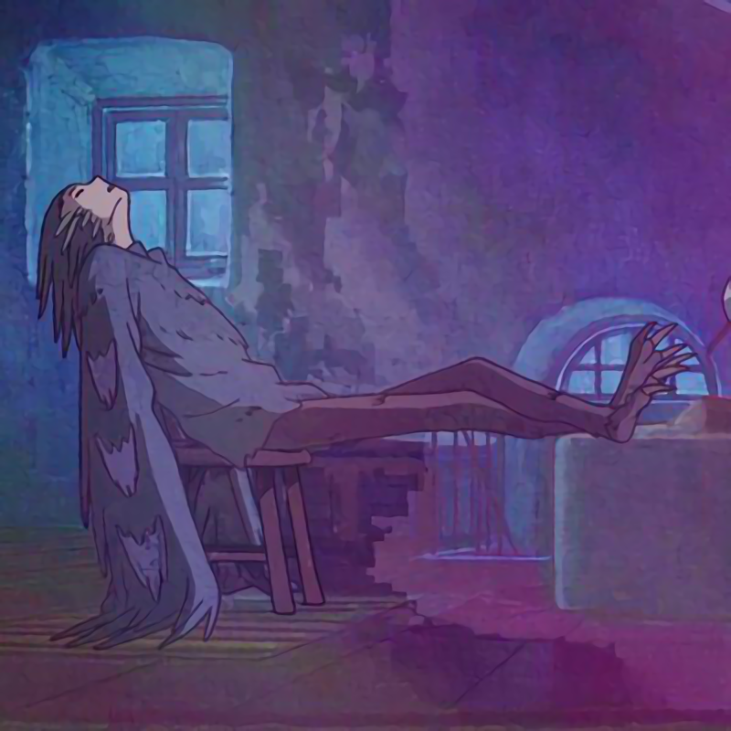
This was used at the splash screen for dev builds in 2011. The dev splash screens have always been a bit memey.
Added: https://github.com/GNOME/gimp/commit/eb0591f97dca152ec827db083f910b6a9ea16369
Removed: https://github.com/GNOME/gimp/commit/5b4db22ae1b3d3c9aa7a91cb64e29e4f1b15ed18That’s a really neat bit of history. I wish I knew about this sooner, some of those look really cool. Thanks.
The name of the program is part of the context.
I also require this
as will I
Porn sure seems a lot tamer than it did last time I saw any
What kind of weird grunge art splash screen is that? For an art program splash screens typically represent what can be made in the software. If I saw something that ugly by the devs of an art app I’d run.
Typical of the open source world. Full of programmers. Barely any designers/artists.
Over on the site that shall not be named, I was able to find a thread that describes it. It was real, and it was the valid splash screen for GIMP from December 2010 to September 2011.
Someone else in the thread remarked that this release was when they introduced the cage tool, so the image does make sense…
A church IT administrator somewhere does a full system update and goes home for the night, while the next morning the pastor decides to load it up to do a bit of graphics work on the church newsletter…uh oh…
Deleted my original bc someone posted the same thing I did moments before, but yeah… thankfully it was just a dev build, so thankfully for them in that hypothetical situation, it isn’t something they would have seen.
They molest young boys, so this is par for the course.
I told my coworker that GIMP was named in reference to Pulp Fiction. I ought to send this to him as proof.
Hah, they really should bring this back! 😆
I uninstalled Kira because of the splash screen.


