

Voting has ended! Congrats to @fer0n@lemm.ee with option B. Thanks everyone for participating! :)
First off, thanks to everyone that participated in our icon contest last week!
I’m excited to show the final three options for you to vote on below!
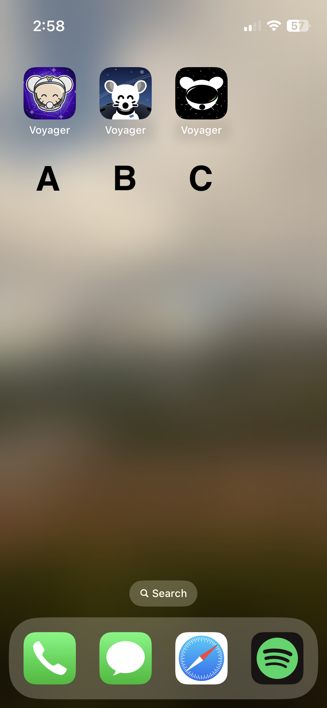
Overview
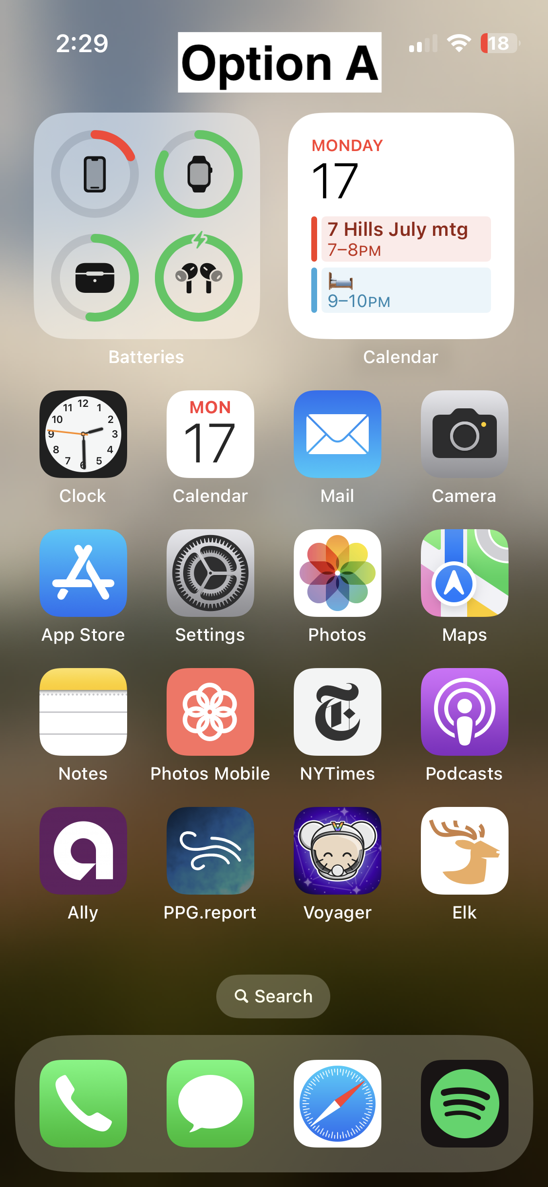
Option A
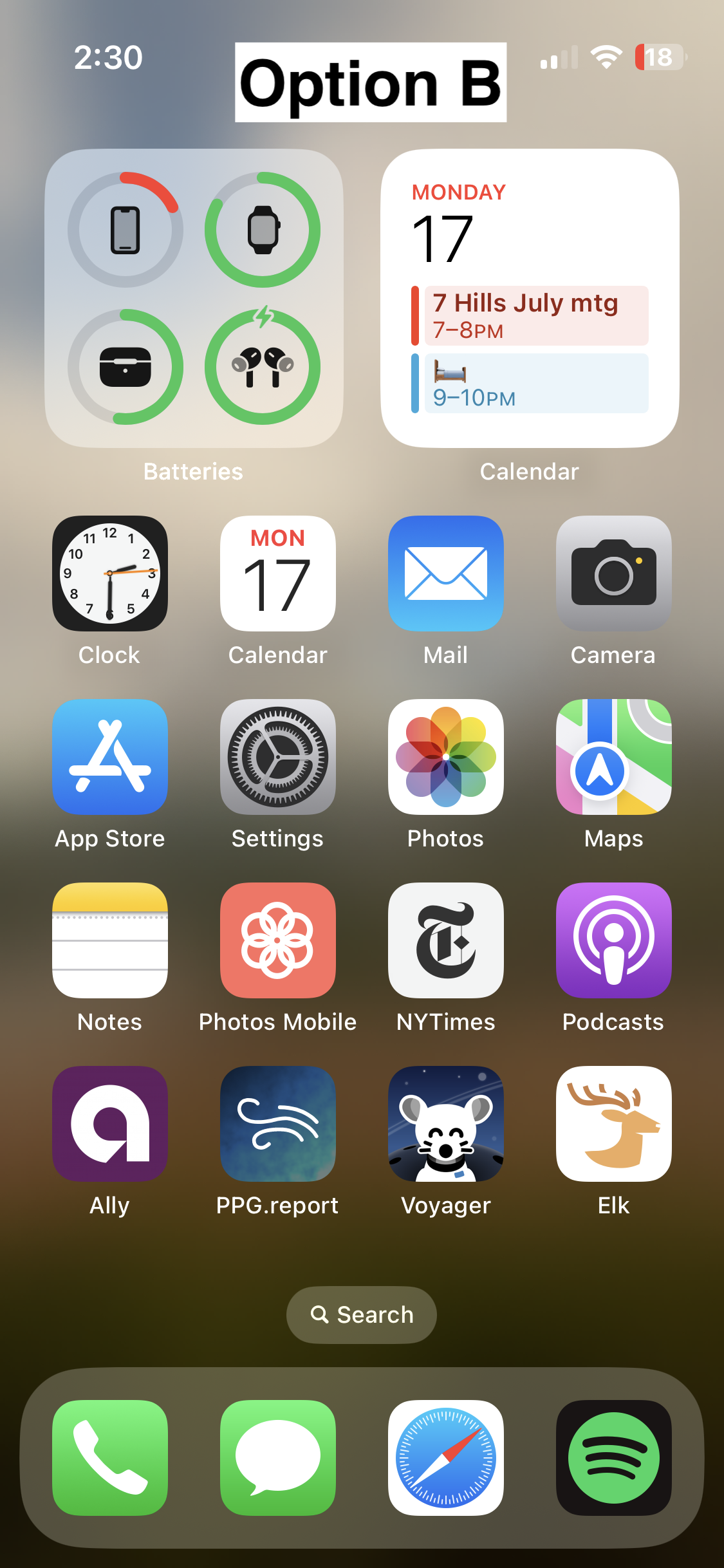
Option B
- 📸 On homescreen
- 📸 Icon
- Credit: @fer0n@lemm.ee
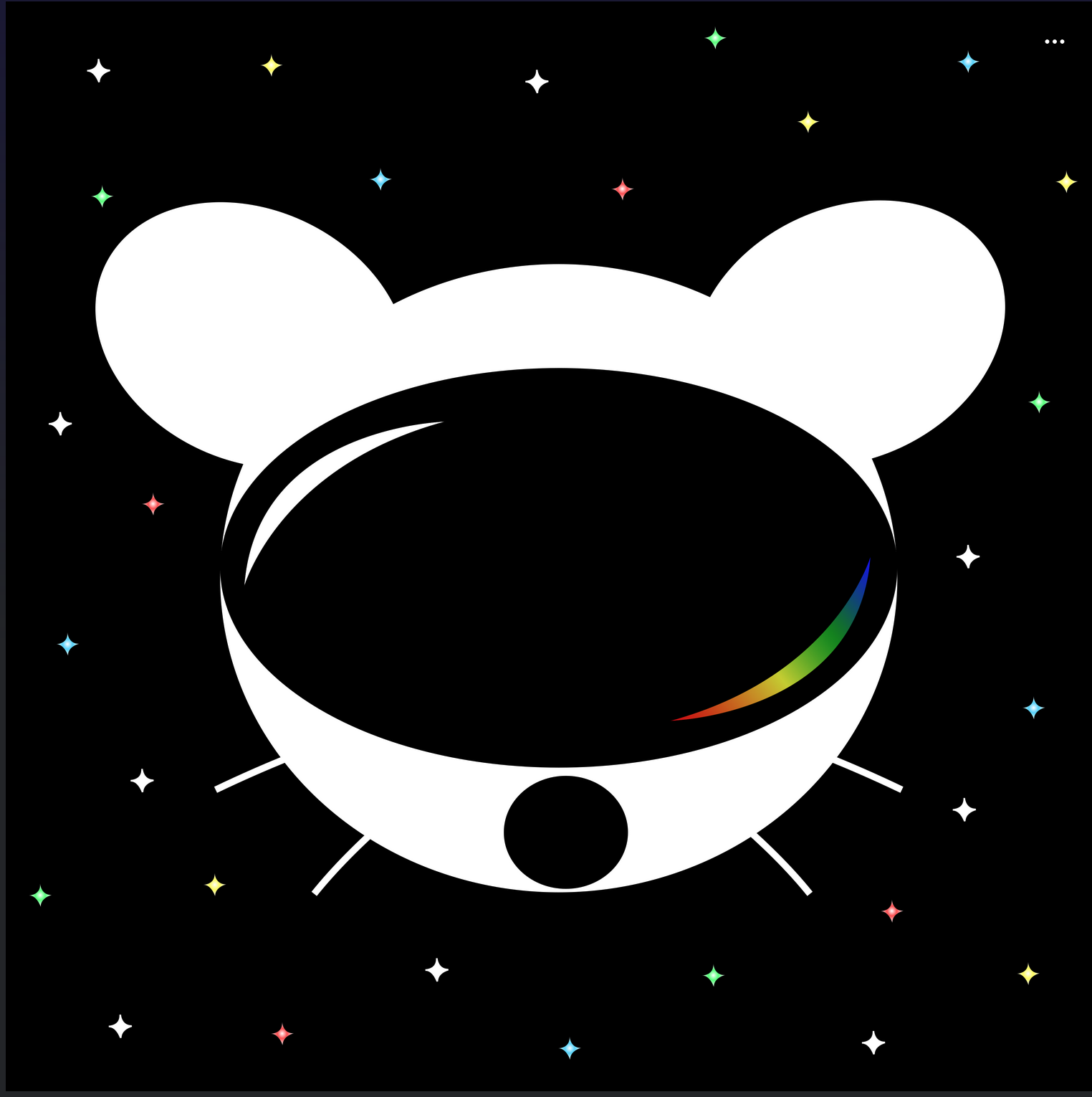
Option C
🗳️ Vote!
⚠️ BEFORE VOTING I encourage you to tap through the links above to see what it’s like on your homescreen!
Results of the poll will not be available until it has ended, so no need to make a rushed decision.
VOTE HERE: https://strawpoll.com/BDyNEbKeqZR
Polling ends in ~24 hours! If there is a tie, I will cast the final vote.
You must log in or register to comment.
I think B looks the nicest of the three by far. Good use of a monochromatic color scheme, nice balance between background and foreground elements, perfectly readable at a distance.
The design direction of A is a bit busy and stands out a little too much IMO, it looks kind of out of place next to stock iOS apps. C looks a bit too amateur, and has several tangents in it that really bother me - I do like the overall idea of it, but it could really use a rework.
If one is chosen, I’ll give the author the opportunity to tweak :)
Good to know! :)
Couldn’t agree more. A is lovely, but too cartoony. B is very cohesive and well made. C, as you said, looks amateurish, and the visor looks like a VR headset.
I started with C, but then clicked the links to compare what hey all looked like on a Home Screen (yes, I eventually followed instructions … look at me go). B is clearly the standout for me.
I hate to say it but the options are a bit disappointing. They look, for lack of a better term, “amateurish” for what will become the app’s brand.
I wished the top community upvoted submission was considered:
I though C was the top one, but you’re right. One of the two there should’ve been up there, they look great.
I vote for C.
Kinda looks like that apple vr
Yes, though only because Apple just used pretty much a standard ski goggle aesthetic.
Same
C, def.
C all the way
Definitely B
B!! :D
Add me to the “unfortunately I don’t think any of them are great and can’t/won’t single out one to vote for, but truly appreciate all the effort that’s been put in” list
This is what I thought too. The original icon is better then the given 3 options. Sorry about all the effort from the contestants.
deleted by creator
C
B with the helmet of A (minus the “V”)
Quick comparison on Android (custom launcher): https://i.ibb.co/XVnM2NL/comp.png
I liked these too (Android): https://i.ibb.co/6ymf6xQ/vger.jpg
I like B the best
C
B for sure
B. A is also good. Don’t like C at all.
Dutch?
Is that legal? ^^ Probably my favorite of the Lemmy app icons so far


![[WINNER: OPTION B] Choose Voyager's icon!](https://lemmy.world/pictrs/image/5423bb2e-347a-4f42-b303-1c8cfbe09ab6.png)