You must log in or register to comment.
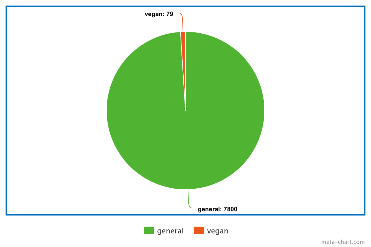
As someone who does a lot of data science for work, this looked off immediately and I was right. The proportions of the vegan slice are exaggerated. Here’s actual ratio

Interesting. Would you have a source?
I don’t care if it’s accurate, I just see how many people I’m superior to because I’m vegan.
Removed by mod
You can question the look of the graph however lacking a source does not automatically make an infographic misinformation.


