They better change that taskbar before releasing to consumers.
They somehow managed to combine the “take up the full width no matter what’s needed” mentality of Windows with the “show the user no useful information whatsoever” mentality of MacOS.

Doesn’t look too bad for me
Yes it does. Look at the giant black bar at the bottom of the screen.
Notice how, like Windows, it takes up the full width no matter what is on it, yet like MacOS, doesn’t even tell you which individual windows you have open.
They took the worst of both taskbar UXs.
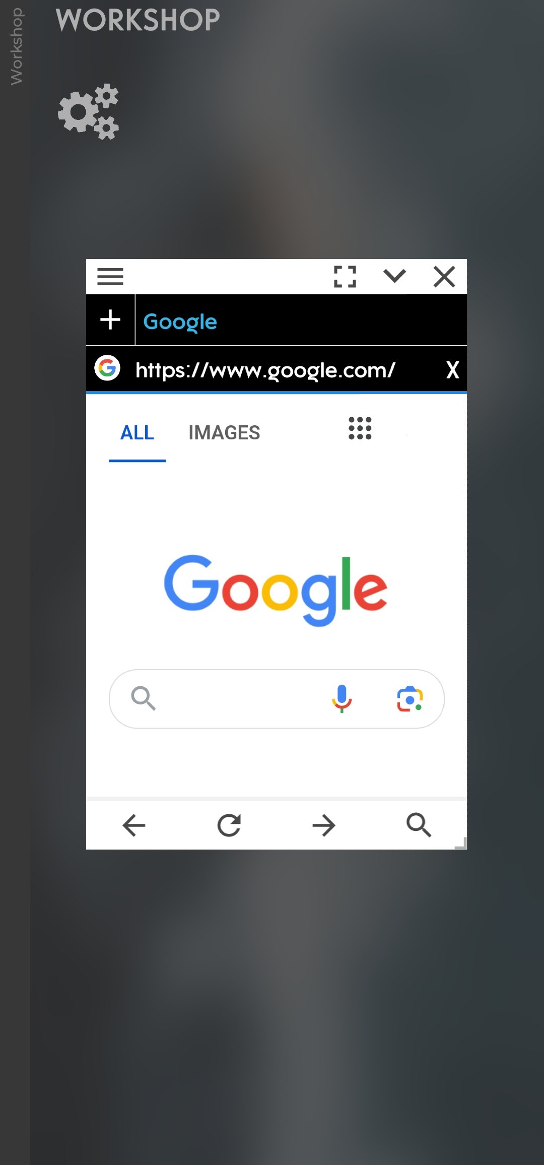
I’ve kinda been doing this for a while now, with the help of the floating overlays App, although the availability of supported floating Apps is limited at the moment.
Playstore Link :
https://play.google.com/store/apps/details?id=com.applay.overlay

The question is, how long until third party launchers start putting out custom desktops?


