- cross-posted to:
- firefox@lemmy.world
- cross-posted to:
- firefox@lemmy.world
the only thing you need to see from the article:

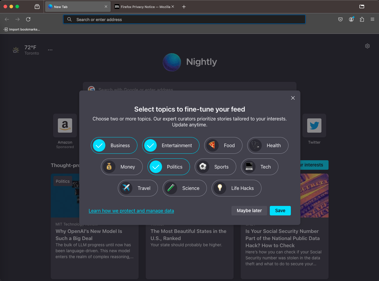
the image shows firefox, and in it a question window of what kind of topics you want to see in your Pocket Recommendations.
The “Save” button is bright, the “Maybe later” is not, the “None” button is non-existent: it’s not an option that you dont want to read pocket recommendations!But at least the topics are curated by experts, so there’s that.
Ironically, I don’t always agree with the Mozilla brass, but when the CTO said
We consider modal consent dialogs to be a user-hostile distraction from better defaults.
… I kind of agree, in just this on instance. What a dialog to present.
Horray that is exactly what I asked for.
Seriously though they should go the minimalism route. I think that is part of the appeal of Chrome.


