I love the idea of kbin, but I’ve found the UX could be improved. Honestly, I like it better than new reddit already, but I find it doesn’t quite feel as nice as old.reddit.com to me.
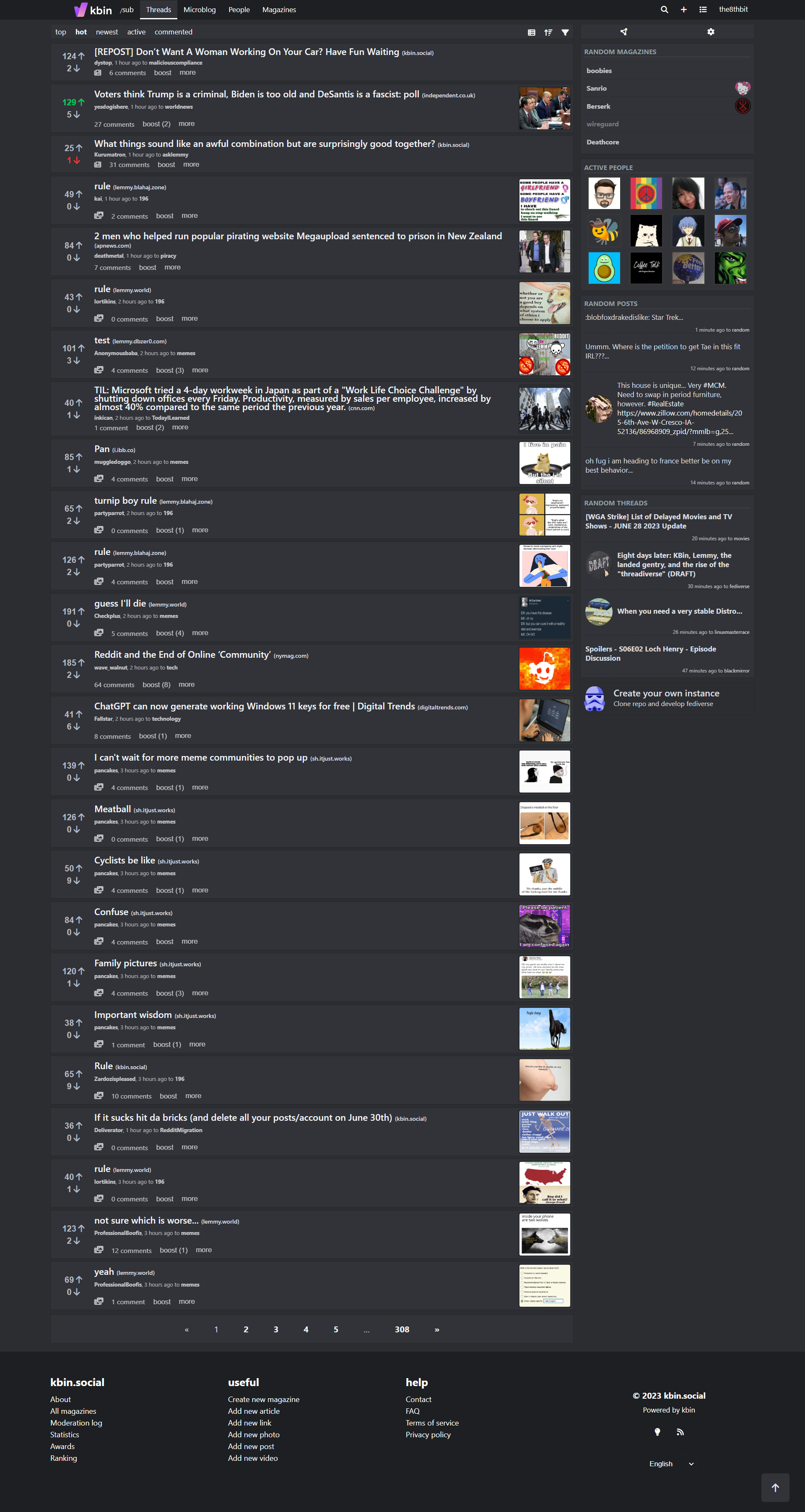
This motivated me to throw together a stylus theme to give kbin a little more of an old.reddit feel. I got rid of a lot of the whitespace which pads out the site, and made some other tweaks I think make it look better. I’ve also replaced both the upvoted and downvoted colors with ones that are a little easier to read regardless of which color theme you’re using.
This stylesheet should be compatible with any kbin UX configuration. Its been tested with every theme, compact mode, thumbnails, all 3 font sizes, and all of the other kbin user options. It shouldn’t interfere with the mobile view either, however, all of the changes, other than the vote colors, are turned off since kbin’s vanilla mobile view is pretty solid. (at least, imo)
I also tried to keep this accessible, using rem for most sizing, so if you configure your browser to have a custom font size, this SHOULD play nicely.
This is a WIP, so if you notice that anything is broken or ugly, please don’t hesitate to let me know.
If there’s any interest in integrating any of these styles into kbin proper let me know. I’d love to help kbin look beautiful out of the box, and I’d happily put in a PR, but I figured starting with a stylus theme would be safer since I’m not sure if the admins or community have an interest in these changes yet. Obviously if I did put in a PR I’d rewrite a lot of this to take better advantage of custom properties and integrate these styles into the kbin stylesheets less awkwardly.
Very nice. Also post to m/kbinStyles. Here it will get lost pretty quick.
@the8thbit I wish we could integrate these info kbin itself. Unfortunately I use a mobile browser without extensions.
This is cool. While I found the regular UI fine for me, I get why some people would want something like this. Nice job!
Thank you! :)
I adore this. I defaulted to old.reddit.com with an extension for good reason. I don’t mind the way kbin looks but stuff like this might make the move over here easier for new users.
Neat! Looks like a fully baked version of the quick&dirty userstyle I had been throwing together for my own usage throughout the last couple of days.
Very happy to retire mine in favor of yours! :D
I would love this for mobile view myself tbh. I’m used to RiF where I could view 10 posts at once before scrolling, but the kbin progressive app and mobile browser only give me 3-4 due to the content being stacked on top of the title. Moving it to the side like this would alleviate that to some degree I think.
Thanks! I’ll look into making mobile tweaks eventually. Right now mobile should be identical to vanilla, other than the vote color changes.
If you go to settings, you can disable thumbnails to make room for more posts.
I’m very tech illiterate.
…Is there anyway I can use this on safari from my iPhone, as it is right now?
I’ve exclusively used old.reddit for the past decade and would love to go back to that visual!
I’m not sure if you can install stylus in mobile safari. However, even if you could, I left the mobile (portrait) view largely unchanged. I’ll eventually take a look at doing a proper mobile view, but I didn’t want to deal with that headache yet lol
Nice work! Do you think they will add shortcuts to your subscribed communities/magazines like old.reddit has?
Awesome, thank you!
Absolutely love it, much better. Great work!
Looks very good, combined with the excellent https://userstyles.world/style/10313/ theme it’s perfect. Thanks!
deleted by creator
Pretty slick. The absolute positioning and sizing of the avatars and voting buttons is a little finnicky on Chrome. But tweaking the sizes a bit made it workable.
So, I threw that together right before bed as an experiment. As I mentioned in this comment it actually uses MORE space, but looks a little nicer imo… but yes, I had to do some really hacky stuff with the positioning to get it to work with the grid used for comments.
If you wouldn’t mind, could you provide a screenshot of the issue you’re experiencing and/or the code you changed to fix it? That way I could fix if for everyone :) Do you use a non-standard font-size?
Not sure honestly. And I reallllly suck at CSS so take what I say and did with a grain of salt. Here’s what it looked like before my changes (me replying to you):
I then lowered a few sizes.
        .comment figure > a > .no-avatar {
           //
            border-radius: 5px;
            width: 1.615em !important;
            height: 1.615em !important;
          //
      }
Same for the vote buttons
Hmm… no matter what I do I can’t seem to replicate this… I’m going to make a top level comment in this thread later tonight or tomorrow and tag everyone who’s said they’re using the this stylesheet to ask for feedback on a few changes I’ve made that I keep going back and forth on. I’ll also include this issue, maybe someone else has experienced something similar or can figure out how I can configure my settings to replicate the issue… I’d really like to figure this out
I’m on Linux (Arch with KDE) for whatever that’s worth. So I am very likely using different fonts than you. I haven’t messed with any of the browser font settings though so those should all be the defaults. Happy to pair with you on this further if you want. Tho not sure the best medium for that.
Love it! If you want to spend the time on it, can you take a look at microblogs too?
Sure! Thanks for giving me a heads up, I haven’t looked at microblogs at all with this stylesheet yet. Luckily it doesn’t seem to break anything, but I’ll work on making it a little cleaner like the rest of the sheet tomorrow after work.
Fantastic! Thank you so much, this is exactly the look I didn’t know I needed for this site!
For anyone else that was already using the “Kbin.it” style, looks like this conflicts a bit (up and down vote buttons didn’t look right). I ended up just turning that off now that Kbin has directly added those features (expand/collapse comment tree and moving the reply form to the top of the page).
Is there a link to that style?
Awesome. Didn’t even know Stylus existed, and this style works for me. Thanks.
Stylus is awesome! I recommend checking out DarkReader as well. Even if you don’t like dark mode, you might find it useful. It automatically recolors sites (by default, to a dark mode), but its highly configurable through various sliders and options that effect how themes are autogenerated.
When I go to a new website/app from desktop, the first thing I always do is tinker with darkreader, stylus, and whatever site settings exist to get a look and feel I like. :)