

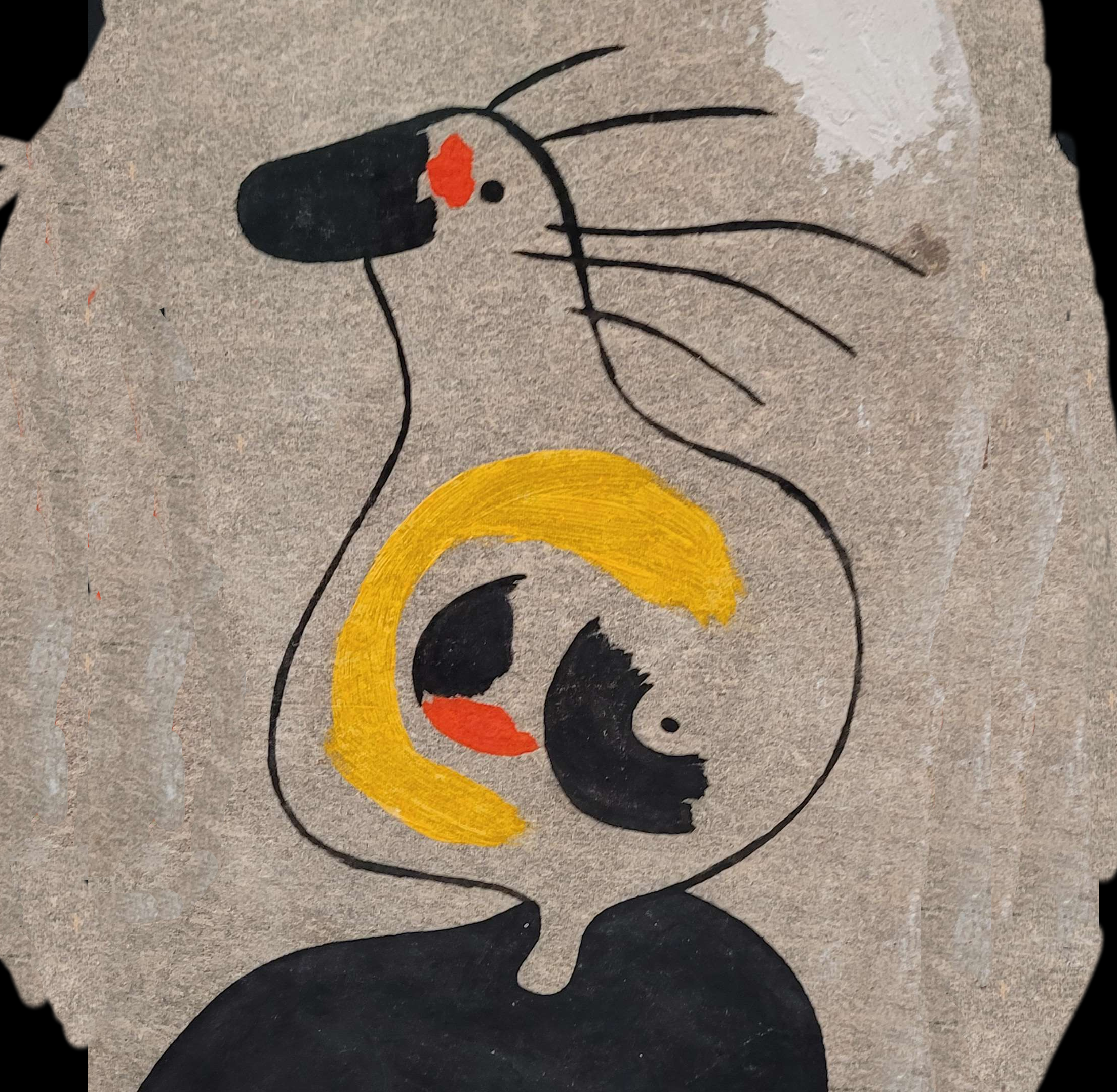
Last week, I tried describing what I was thinking for a new logo for this community. Here’s my attempt at showing what I was thinking. Yes, it’s very amateurish and I would love for someone to make it better, but it shows my intent. Also, I think it’s somewhat recognizable when shrunk down:

I’m still open to the idea of others creating a new icon, but if I don’t get anything else I might use my mod powers to declare that by unanimous consent everyone agrees my half-assed icon is the best.
You must log in or register to comment.
Nice work! I really like it.
Not that my opinion counts but I’ve always hated the Lemmy mouse logo
That’s fair, but it’s the logo we’ve got to work with so I’m going to try incorporating it. Also, I don’t know if there’s any other unique image that would represent the cyberpunk genre without referencing specific works. I’m definitely open to suggestions though.
The submissions by tri_poloski and Cloudless were pretty good too.
Maybe we can alternate or something.
I’ll probably hold a vote and see which one wins. I want to give it a bit more time though. Maybe next weekend.
Looks great!

![[Art] My attempt at a new icon for this community](https://lemmy.zip/pictrs/image/11c916db-1ca9-4715-a15a-0bd793413010.webp)