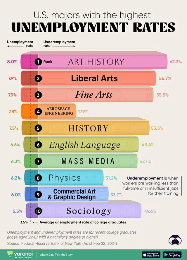
The total number of LA holders is irrelevant since everything is presented on a percentage basis. The fact that it isn’t close to the national average is evidence of being different from the overall population.
Although, I suppose an overabundance of LA degree holders could lead to higher unemployment. But that doesn’t change the conclusions that can be drawn from the chart.
Edit: rereading the thread, I agree with your point that the graph is only showing which majors have high unemployment rates. Where that cause stems from (too many people with those majors for instance) isn’t the intention of the graph.
Not certain I agree fully with your statement
But that doesn’t change the conclusions that can be drawn from the chart.
Is a liberal arts degree hard to get a job with because of too many people with the degree, or because there isn’t sufficient transferrable skills included in the degree? All we know is that these jobs aren’t best for securing a job after graduation.
I think we agree with each other. The only question the chart answers is whether or not these degree holders experience higher underemployment than the overall population. The question of why is irrelevant to this chart.
I was trying to disagree with the OPs skepticism that the chart is somehow misleading because it ignores the number of LA degree holder.

The total number of LA holders is irrelevant since everything is presented on a percentage basis. The fact that it isn’t close to the national average is evidence of being different from the overall population.
Although, I suppose an overabundance of LA degree holders could lead to higher unemployment. But that doesn’t change the conclusions that can be drawn from the chart.
Edit: rereading the thread, I agree with your point that the graph is only showing which majors have high unemployment rates. Where that cause stems from (too many people with those majors for instance) isn’t the intention of the graph. Not certain I agree fully with your statement
Is a liberal arts degree hard to get a job with because of too many people with the degree, or because there isn’t sufficient transferrable skills included in the degree? All we know is that these jobs aren’t best for securing a job after graduation.
I think we agree with each other. The only question the chart answers is whether or not these degree holders experience higher underemployment than the overall population. The question of why is irrelevant to this chart.
I was trying to disagree with the OPs skepticism that the chart is somehow misleading because it ignores the number of LA degree holder.