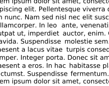
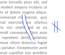
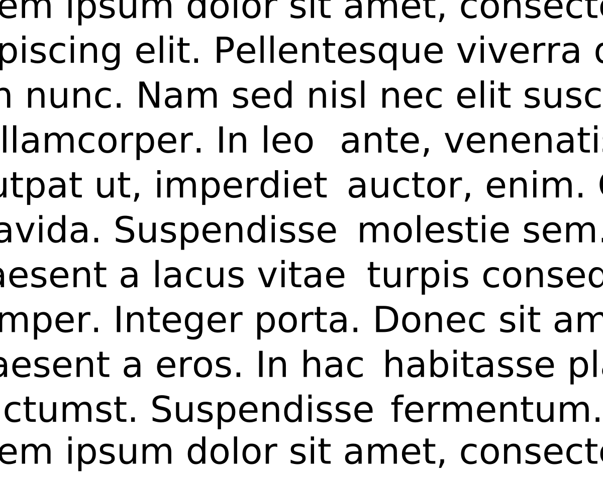
In typography, rivers (or rivers of white) are gaps in typesetting which appear to run through a paragraph of text due to a coincidental alignment of spaces. Rivers can occur regardless of the spacing settings, but are most noticeable with wide inter-word spaces caused by full text justification or monospaced fonts. Rivers are less noticeable with proportional fonts, due to narrow spacing. Another cause of rivers is the close repetition of a long word or similar words at regular intervals, such as “maximization” with “minimization” or “optimization”.


Now I want to have written a book that utilised this to set the scenery. Let’s see the translators deal with that!
House of Leaves uses a bunch of gimmicks like this… Kind of forget if he used “rivers” specifically, but I’d be kind of surprised if he hadn’t.
Removed by mod