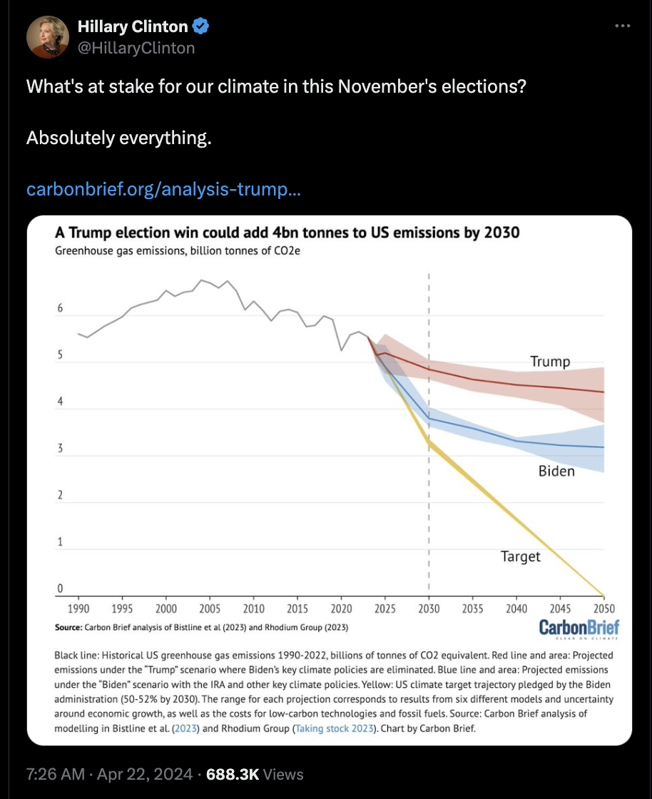
But the graph gets worse, not better! I know that it’s all make believe and isn’t part of reality, but why did they put into the graph that they start aligning with Trump and adopt a much worse climate policy in 2030? It’s their graph! They could have just not done that!

continue being dead
I mean, yes, but why will that halt the reduction of US emission? Why did they put that sharp turn into the graph!?
because that’s when we’ll start doing stuff we promise, just a few more votes
But the graph gets worse, not better! I know that it’s all make believe and isn’t part of reality, but why did they put into the graph that they start aligning with Trump and adopt a much worse climate policy in 2030? It’s their graph! They could have just not done that!