Over the last 3 weeks there have been significant contributions from h3ndrik and myself.
H3ndrik
- Many many under the hood improvements. Simplifying code & improving performance.
- Better lightbox
- Improve post teaser layout
Rimu
-
Mod log which shows all moderator actions
-
The “Rational discourse toolkit” block in the bottom right is now optional - instance admins can turn it off in the settings.
-
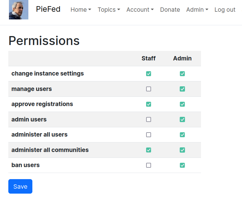
Staff role - some admin tasks can be delegated to a supporting role which can do limited things. Which operations the supporting role can do can be controlled with checkboxes. This is nearly complete and just needs a bit more elbow grease.
-
A.gup.pe integration - These are a kind of basic community / group function built on Mastodon. About 20% of new posts on piefed.social are coming from Mastodon, mostly via a.gup.pe. These groups include
- https://piefed.social/c/photography@a.gup.pe
- https://piefed.social/c/actuallyautistic@a.gup.pe
- https://piefed.social/c/auscovid19@a.gup.pe
- https://piefed.social/c/fedibikes_de@a.gup.pe (German)
- https://piefed.social/c/classicalmusic@a.gup.pe
- https://piefed.social/c/histodons@a.gup.pe
- https://piefed.social/c/actuallyadhd@a.gup.pe
- https://piefed.social/c/bookstodon@a.gup.pe
-
Community wikis - moderators can create pages that serve as a resource for the community. Each page has revisions that can be reverted to. See a demo at https://join.piefed.social/vlog/piefed_wikis.mp4.
Thank you both for continuing to improve piefed, massively appreciate your efforts!
Impressive, thank you!
One small suggestion: For microblog content, maybe including [microblog] after rather than before the title would make content more digestible? Where something was posted from is, after all, rarely the most important feature of a post. :)
Yeah I’m finding it jarring, too. Perhaps an icon, instead…
An icon would be ideal for sure. The Mastodon logo would be informative but inaccurate.
Part of me wonders if its even necessary at all - is it that different from other types of posts? Maybe an icon indicating whether something is a text post, a link, an image, or a video is more useful, with most microblogs being text posts?
The types of content coming from microblogs vary a lot. People can probably tag WordPress or WriteFreely content into a.gup.pe, as well as images and video. So its not like its all microblogs or a necessarily uniform type of content.
With that in mind, maybe a small Fediverse logo would do?
Just thinking out loud, sorry for the winding post.
Will think about it


