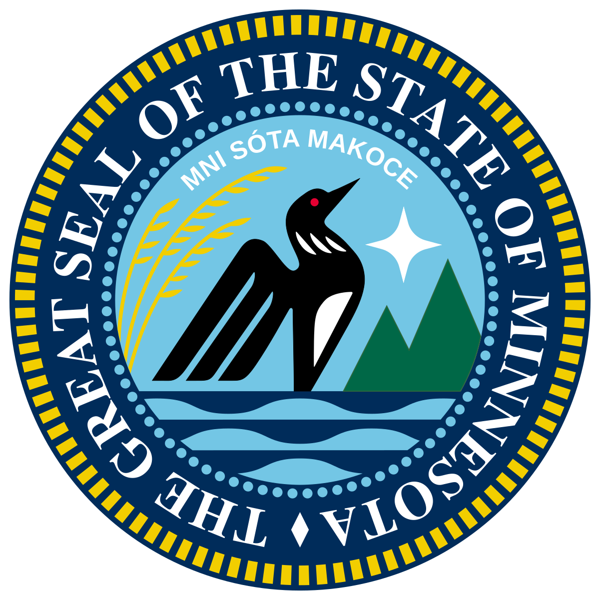
The previous icon and banner got lost somehow, and I’m not sure what they were since I’m just starting mod duties now. Anyone have opinions on what we should put as the community icon and banner? I unimaginatively put the new Seal of Minnesota as the icon for now.
Post any ideas you’ve got below. Preferably stuff that’s permissively licensed or public domain, or generally wouldn’t be a hassle.
I liked the laser loon flag for the banner. Only downside is that I don’t know how to make it look good. Some other Lemmy comment I found says 5.9:1 is the best ratio to use, so maybe just crop it?
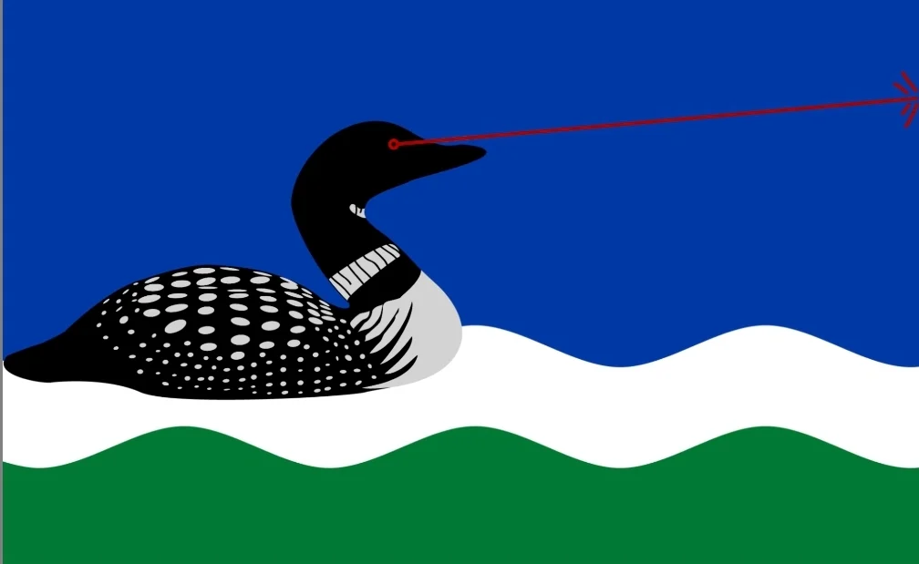
It would be very easy to expand the outside instead of cropping it tbh. Outside of the Lazer loon most of it is just the wavy lines.
I could probably do it if you needed someone but I am unable to do it until at least morning.
If you’re up for it, that’d be great! If not, no worries, I’ll probably try my best in a few days
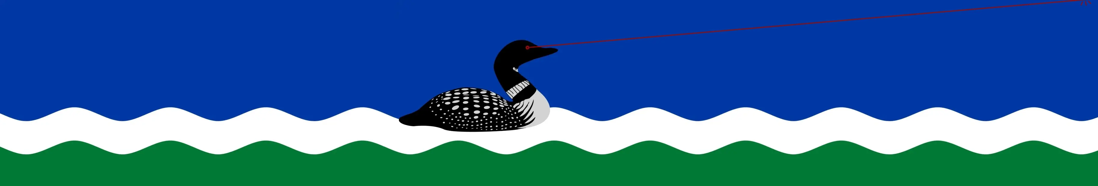
Sorry it took so long!
That’s amazing, thank you! I’ve updated the banner
I thought this might make a nice banner if cleaned up or artified somehow, but that’s beyond my skills. As-is, I think it would zoom in weirdly and look off