
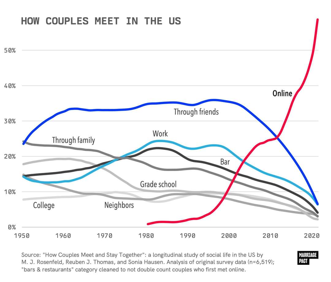
It’s been trending this way for years, but seeing it graphed out like this is shocking.
What do you think are the effects of this drastic change?
It’s been trending this way for years, but seeing it graphed out like this is shocking.
What do you think are the effects of this drastic change?
(**edit: I had accidentally grabbed a graph about same-sex relationships without realizing it and have removed.)
Unclear what study that is referencing, but it’s notable that Michael Rosenfeld is also the first listed principle investigator in the study referenced in the OP, likely part of the same project, since they list updates for every few years (How Couples Meet and Stay Together (HCMST) 2017, 2020, 2022, United States). Also unclear who compiled the graph or where it was originally published. I want to reiterate that this study itself seems to very much not line up with the graph, unless I’m misreading it very badly.
The BBC article is about a book, Modern Romance, and the book makes a claim that 35% of Americans met their spouses online (“respondents who married between 2005 and 2012”). This checks out with the cited source study, which makes an identical claim, though there’s reason to be suspicious of it since it was funded by eHarmony. The scope there is a little different than “all couples”, but it’s still a very different number than what is in either this article’s graph, or in the OP graph, which are very different from each other as well (saying the number reached 70% by 2009 vs saying it reached 60% by 2020. I would think that if these graphs are genuinely based on research by Michael Rosenfeld that they would at least check out with each other.
Here’s what I think is probably going on here: people working for the marketing departments of dating apps fabricate bogus graphs, falsely attribute their source to real studies, and push them on social media to go viral. Then people writing articles like the one you linked about the subject copy paste those images without checking them, because it’s just a fluff piece for a recently published book and they don’t have much time to spend on it.
Where did you originally find the OP image?
Edit: Just noticed that the second graph is specifically about same-sex couples.
Sorry for removing the comment you just replied to. I didn’t realize I had grabbed the wrong graph from the article.
You could be right. I believe I found the original image circulating on reddit or tumblr (it was a few days ago).
I haven’t had the opportunity to read your link directly to the study yet.
This is for same sex couples which for a large variety of societal reasons likely wont reflect the dating scene among the average population, which skews heavily hetero.
Oh shoot, you’re right. I grabbed the wrong one. I was just looking at the dates.
The hetero graph in this article only goes to 2009, so this whole article probably isn’t too helpful. I’ve removed. Thanks