- cross-posted to:
- firefox@fedia.io
- firefox@lemmy.ml
- cross-posted to:
- firefox@fedia.io
- firefox@lemmy.ml
Total 2022 pay: $6,903,089
Total 2023 pay: $6,260,072 - a $643,017 decrease
Base chair pay: $600,000
2023 chair bonuses and other incentives: $5,622,600
Sources:
For comparison, here are other executive salaries ($0 bonuses for each)
| Executive name | Title | Total Pay (2023) |
|---|---|---|
| MARK SURMAN | PRESIDENT & EXECUTIVE DIRECTOR | 715,143 |
| J. BOB ALOTTA | SVP, GLOBAL PROGRAMS | 508,138 |
| ANGELA PLOHMAN | COO, SECRETARY & TREASURER | 452,234 |
| ASHLEY BOYD | SVP, GLOBAL ADVOCACY | 427,701 |
| ZHILUN PANG | DIRECTOR OF FINANCE | 273,069 |
| DAVID WALKER | SENIOR COUNSEL | 268,565 |
| LAINIE DECOURSY | DIRECTOR, ORG EFFECTIVENESS | 267,028 |
| JUAN BARANI | SENIOR DIRECTOR, GIFT PLANNING | 262,879 |
| STEPHANIE WRIGHT | SR PROGRAM MANAGER, MOZFEST | 236,785 |
In case it wasn’t clear what they’re being paid for. Sheesh
The enshittification of Mozilla started when they hired a greedy suit instead of a passionate engineer.
They had no response to Node, V8, or Electron. They made no effort to catch up, either. Mozilla needs a purge of senior leadership, or it’s going to zombie walk into irrelevance. I say this as a Firefox user.
I hate the color choice for the graph, I literally cannot tell which line is which. At least the data was down there.
In the nicest way possible, you are likely colorblind then.
It’s green and orange, not exactly difficult typically.
Oh, I’m aware of that, got tested long ago. I get this is not a problem for everyone, but one of the lines being red or blue would have taken no additional effort.
I think the problem isn’t about effort. Its something people aren’t aware of(myself included).
Orange and red would be a bad decision, and green and red would also be impossible to distinguish if you’re colorblind.
You may very well be colour blind friend. Get tested for green-red specifically.
This graph makes it look like increasing the salary of the chair significantly slowed down the loss of their users, was this what you intended by it?
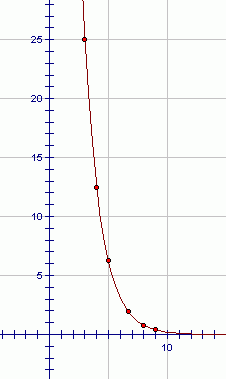
From a page about geometric percent decreases, explaining that that kind of graph represents an unchanging loss of a percentage of the measured value every interval:
The sequence 100, 50, 25, 12.5, … is a geometric sequence. The common ratio is 1/2. To go from term to term, you keep multiplying by 1/2 (i.e., dividing by 2).
The graph of the sequence 100, 50, 25, 12.5, … is shown below:

Ahh the good old causation vs correlation curve. Back to school with you 🤣.


