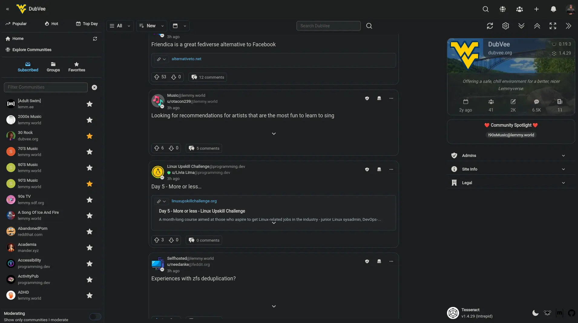
The post image shows Tesseract in dark mode with the Dark Reader extension active. It’s not supposed to look like that lol. In the SpaceX post, the text should be legible with a gradient effect, but DarkReader breaks that. Also, the borders should not be anywhere near that pronounced.
This is how it’s supposed to look in native dark mode

Native light mode + Dark Reader looks kind-of okay (I may even adjust the native color scheme to be closer to that), but it still breaks the gradient effect on collapsed post previews and makes some buttons appear disabled:

You can disable Dark Reader on a per-site basis, and it’s recommended to do so for Tesseract. Customizing the native themes to work better with Dark Reader is obviously not a priority since there is a native dark theme already lol.
Edit: I found there’s a way for the app to tell Dark Reader to disable, and I have that added to the dev branch. I’m working on making that “disable” header dynamic, but for now, I’m fine with statically disabling it.


Yep, I had the same experience, but it’s trivial to disable DR for a domain, so I wouldn’t put much effort into it.
Somehow DR got re-enabled for me in dev after I had just made some tweaks to the Tailwind config. Freaked me out for a minute because I thought I royally screwed up Tailwind lol.