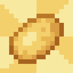
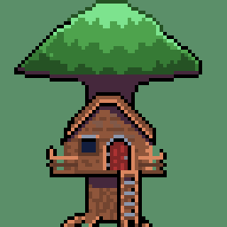
I’ve never been a huge fan of how Minecraft’s paintings looked. In contrast to the great pixel art of most of the game’s textures, the paintings seem like cropped and downscaled JPEGs of their original counterparts, sometimes with an edit mixed in. Thus, I started a project a while back to redo the game’s paintings. I’ve done 20 so far and have 6 left to go, and I figured I’d share what I’ve currently done here! I plan to release these as a resource pack when I’m done.
Wow this took a few back and forth a to notice the differences but even the ones that are the most similar are improved immensely by your fixes. I especially love both the skeletons paintings, but overall clarity is so much better.
I did mean to ask, of the two paintings where it seems to look out a window and one has a creeper and the other is similar bit seems to have some kind of plant, may I know what you interpreted the original plant to be and why that was such a big change in yours? To be honest, I’m not sure if it’s a tree in the distance that yours is supposed to be :)
Glad you like my renditions!
When I made these paintings, I was mostly basing them off of the original paintings more than vanilla Minecraft’s renditions, some of which have edits. With the plant one, for example, I based my plant on the original. In hindsight, I’m not a huge fan of how I’ve done the plant, and I might go back and tweak it or redo it to be more like Minecraft’s.
Ah yours is definitely more true to that, I assumed from the originals it was just a potted plant in a window sill. Yours does look like some small tree on a white background! I think with such small space to work with it’ll be difficult no matter what to communicate the original’s image and you’ve done a great job with what you have, still much better than the original.
Love them, great rendition.


