- cross-posted to:
- apple@lemdro.id
- cross-posted to:
- apple@lemdro.id
Touch Bar is the reason why I’m hesitant to increase specs on apple gear. I still own a macbook that works fine, has lots of SSD and RAM - and a discontinued touchbar.
i will never miss u. Fuck the touch bar
I absolutely loved my touchbar, I used Pock to make it useful. But such is life…
I actually just purchased a refurbished MacBook on Swappa that has a touch bar and I love it. Didn’t expect that.
for anyone that doesn’t like learning hot keys I highly recommend the app cheat sheet. It’s been pretty helpful for pulling up hot keys for me in all kinds of programs *(I’m not connected in any way I’m just trying to be helpful lol)
Either way learning hot keys is obviously the best in software you use day in and out. Takes a few seconds but down the line will wipe hours off your work flow.
Screen shot is a big one. but I just have that mapped to an extra button.
Adding a display into the track pad sounds like a good idea
I still love mine on my Pro.
Man, the Touch Bar. It still has value for me at work since we work with Keynote and live shows a lot. Being able to jump to any slide that is previewed on the Touch Bar saved some asses in it’s short lifetime and for that reason I will miss it. Also when working on the road with the Macbook on your lap was really cool when using the Touch Bar. It had it’s uses, however limited they were but I’m kinda sad it’s gone.
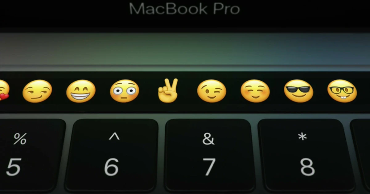
It looks neat. The only time I use it is to find an emoji.
Turned my Touch Bar back into the Function keys within 20 minutes of setting up my new 2017 and 2019 MacBook Pros.
Touchbar was fun, fancy with not a ton of utility that stole the function keys’ functionality! Back to square one with the M series like Touchbar never happened.
I’m considering buying a new M3. Not because I need a new computer, but because the Touch Bar drives me insane.
I adjust volume and brightness often and the touch bar is a huge pain. I don’t know gen deal with the other buttons because it’s an extra button click.
I want my function keys back.
Killed because apple made two major mistakes, first was replacing function keys for something less functional and making the Touch Bar limited in its functionality, I didn’t hate the Touch Bar like others but they spent no time building it out to have a “killer feature”
It wasn’t “ahead of its time;” it was several years after everyone knew the idea was crap.
Lenovo had a touchbar on ThinkPads for one year (IIRC) prior to the MacBook Pro, and then it was removed because no one liked it or used it.
It’s a dumb idea that solves no problems, and making us choose between F-keys, which are actually required by some apps, and an emoji picker was inexcusable.
Good riddance.
THANK YOU, it’s so dumb and I can’t believe people are saying it was ahead of its time.
People get tricked by the fact that it looks cool and futuristic. It’s a terrible idea and it’s embarrassing that Apple tried it after everyone else failed
It held no promise. It was clear that it was a dumb idea the moment the “touch strip” leaked in 2015
There is no potential there, or Apple would’ve pulled it off, and even they couldn’t. The entire reason a keyboard is so functional is because A) the keys don’t change, so you don’t have to look down to type and B) the keys are physically there and you can feel them before clicking, so you don’t have to look down and C) you have to apply physical force before activating them, so you don’t have to look down
All so that you don’t have to look down. The touch bar fundamentally defeats the entire purpose of a keybaord.
It looks cool in screenshots. But it’s so, so dumb


