
by PythonMaps
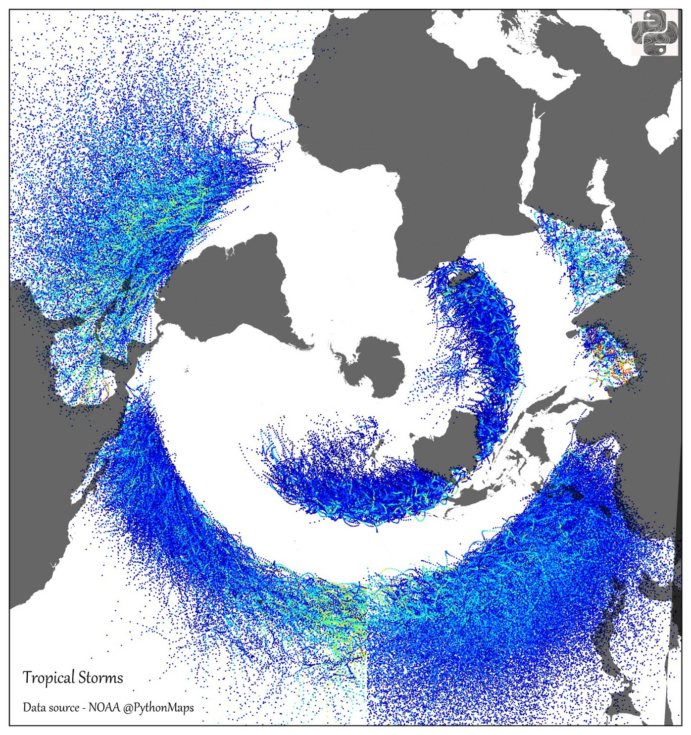
I heard you saying the Mercator projection didn’t deformed the earth enough and made thisbfor you.
I mean, they all have to deform something, mathematically speaking. Usually Antarctica is not picked as the least deformed area, though.
I wonder if this would be better centered around the north pole. I guess a normal non-polar projection would do the job too, since we’re very familiar with them and the fact they wrap around.
What is causing the data artifact at the International Date Line?
I was wondering the same thing. My best guess is that the data for typhoons and hurricanes come from different databases.
Standard east pole counter-magnetic influence in the surface normal vector plane.
(sips tea)
Ah, so an effect of the time cube?
For some reason, this projection is just really messing with me. I can recognize, with a bit of effort, the continents, but their relative sizes and positions is just making it tough to really follow what I’m guessing is an argument on storm patterns.
Can I suggest pushing out a visualization that uses an interactive 3d globe model instead of a single jpg? I feel like if I could scroll up and down between a normal sized Antarctica and a normal sized North America, my brain would be less confused as far as interpreting patterns and interactions goes.
If it helps you, the hurricane belts do have the equator nicely between them.
Oh damn, that’s the equator. It looks so non-centric here I didn’t even recognise it.
Omitting Hurricane Catarina - the only hurricane on record in the South Atlantic https://en.wikipedia.org/wiki/Hurricane_Catarina
I was wondering why South America and Atlantic southern Africa lucked out so much.
Typically, tropical cyclones do not form in the South Atlantic Ocean, due to strong upper-level shear, cool water temperatures, and the lack of a convergence zone of convection.
Now I’m going to go down a rabbit hole about why it’s cold, I guess.
I would’ve liked country lines, I have no clue what I’m looking at from this angle of the globe
It’s centred on Antartica. The prime meridian is up and the International Date Line is down.
Another in my long list of reasons to live in Bali.
They spawn from Oz or head towards?
Where else do dangerous thing come from?


