

I can’t find anyone talking about it (or maybe searching here isn’t my forte yet).
What do you think about it?
You must log in or register to comment.
I prefer the old one, 2000s WEB nostalgia.
New one looks a bit messy :(
It is better now I think.
I feel like the logo has potential, but right now it looks very “graphic design is my passion”. 💀
I’ve made a post just yesterday with some suggestions xD But I guess they were already working on a new one, and the generic globe was just a placeholder.
The new one seems to follow the same style as their Mastodon.world logo.
I think it’s better than the placeholder, but a bit hard to read maybe.
And I particularly would prefer if the Lemmy instances tried to follow a similar design rules (in the logo and overall site design, and if possible in their names/domains lol), so it have a consistent branding and look more visually appealing to possible new users.
I think the old one was a placeholder. The new one looks like the mastodon.world logo
The lettering doesn’t scale very well. I assume it worked better for Mastodon World being “MW.” With this being “LW” the same stylisation looks fairly awkward, especially when scaled down.
Prefer it to the old one
We had a thread with some suggestions in yesterday but maybe Ruud decided all our suggestions were terrible and took matters into his own hands :D
I like it, although it’s a bit unclear when it’s very small, eg as a favicon.
oh yeah, didnt it used to be a globe?
Yes.
i hate it… : (
the old one looked really good; it had character and skeuomorphism and stood out in the instance list
the new one looks… fine, i guess. it’s there. i can’t really say anything about it, apart from it’s a bit dark and too busy, but it has nothing going for it
I think the colors are a main problem, especially the lack of contrast dark blue + black.
Maybe some of it could be overlayed on a simplified globe?
to be honest, it’s the simplification that i dislike. it’s so fucking corporate and soulless, it looks like somebody outsourced it to the cheapest bidder
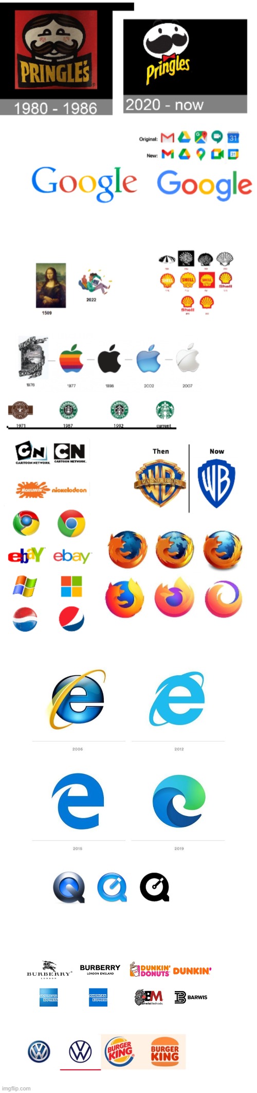
i also think it is starting to look dated, as even corporations are moving back to designs with depth (look at the new edge logo and fluent design in general, or gnome circle apps)
A few look kind of nice, but for others I need c/eyebleach now.
Also, fuck Google and their impossible-to-tell-apart logos! Like, if you have a dozen of Google apps, you need to stop and think because there’s nothing obvious now to identify them.
Sort of comes out as a smudge in a dark square when it’s a favicon. Still, an improvement over the previous one.


