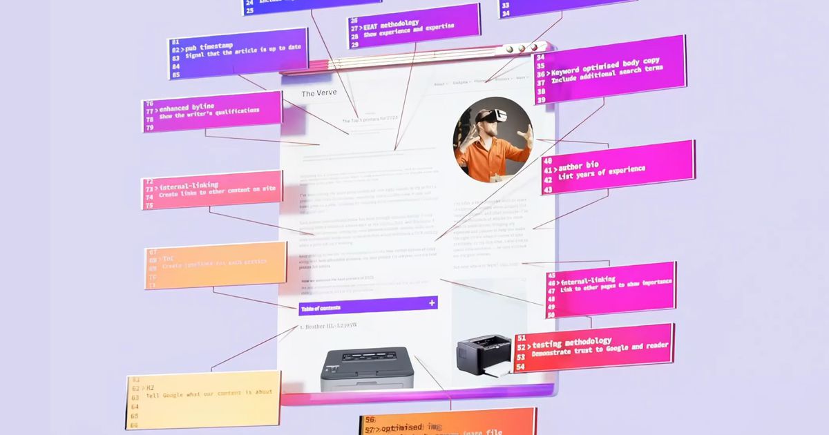
Snippets: For reputable news outlets, the challenge of producing work that Google likes and that meets high-quality standards is magnified; you can’t fill articles with SEO-bait keywords without readers noticing.
The sleazier SEO strategists have already caught on, waiting and hoping for their chance to exploit whatever Google prioritizes. There are product recommendation articles with titles like “Best Espresso Machine Reddit 2023” and entire websites filled with reviews “according to Reddit” that appear to be fake accounts talking to each other. Some subreddits are overrun with affiliate link spam.
Removed by mod
Just gonna leave this here, since the verge is so ‘fancy’: The perfect site
Boo, what a blatant copy of the https://motherfuckingwebsite.com/ /s
Dang, thats the one I meant! Had to search it and only found this one.
I blame Google.
So this change just shows how bad it’s gotten right?
Yeah but I like @tale’s link better since it’s not so potty-mouthed.
It’s also worse because it completely undermines the point by using a horrendous fixed width typeface and dark green on black colours for the text.
Fair point. I kind of worked around that, focusing on the content.
This was hilarious to read right after the verge. I couldn’t stop smiling while reading it. It actually feels like a breath of fresh air considering all of the SEO sites I find myself reading lately lol.
Is anyone else on a high DPI monitor seeing how wild this site design looks?
It looks like ass on a regular phone display. I don’t know what that design is called or why it exists, but it needs to not be a thing.
Yeah it’s madness
It’s not even loading for me (Vivaldi on Android). I ran it through Textized. It’s on the Verge alright… verge of unreadability 🙄
Works fine for me 🤷🏻♂️ (firefox on android w/ some extensions). Defs went a bit heavy on the css tho
Works great for me on FF on Mac OS as well.
That’s a mighty fine username you’ve got there, btw
Speaking of shitty web pages … I think I have eye cancer now.
deleted by creator
I’m stuck at a loading screen on The Verge. F that.
Worse or wurst, pick one.
“Worse” or “the worst”… unless you were going for sausage 🤷
“the worst” doesn’t work in this headline because it just sounds like bad English.
Saw all the complaints about the web page, and as someone who likes creative web lanes from time to time, I was curious …
And yea that shit was dumb and embarrassing. Like the verge has had their branding damaged as far as I’m concerned.
Yeah, SEO sucks and all, but stop trying to reinvent reading webpages.


