
I’m not good at math, but people keep passing this chart around in 
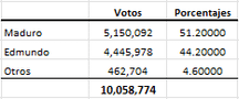
But I keep seeing people in the comments debating whether this is actually “impossible” or not, using stats terms I’m not familiar with. Also idk the source of this graph so maybe it’s bs.
Some Venezuelan channel had a shitty infographic where they mentioned smaller parties multiple times and labelled each of them as 4% instead of their actual vote share so the total added up as above 100%.