
I’m not good at math, but people keep passing this chart around in 
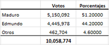
But I keep seeing people in the comments debating whether this is actually “impossible” or not, using stats terms I’m not familiar with. Also idk the source of this graph so maybe it’s bs.
Oh come on, don’t insult your own intelligence
The survey is probably real, but without having access to key data like sample size and who was surveyed
If you survey 10 people in an area where the opposition is stronger, and 7 people say they voted for the opposition, that’s 70% - but certainly not a valid number to base a coup off of
The survey was conducted by a CIA affiliated group if that matters