- cross-posted to:
- tesla@lemmy.world
- cross-posted to:
- tesla@lemmy.world
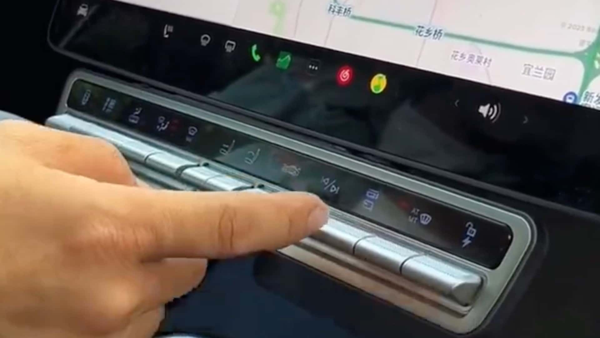
Tesla Model X Owner Has Had Enough Of Minimalism, Adds Physical Buttons::Tesla Model X owner from China has attached a panel of physical buttons to the vehicle’s main control unit for quicker access to some key functions.


Although it’s been this for a long while now
I know, I intentionally bought a 2017 so I would have physical buttons 😂
Thing is, I really wanted CarPlay / Android Auto support. Having had that with a 3rd party Alpine deck, I really got used to it. It’s hard to go back.
But, having some of those controls behind several menus and screens is really annoying. Oh well, at least it’s not a Telsa and I can turn the air vents manually.
I usually just prop my cellphone in front of the car’s screen if I don’t want to bother setting the car’s NAV and I only play two radio stations when I drive so it doesn’t bother me, but I understand what you’re saying (although my experience with Android auto wasn’t great).
I’m mostly in CarPlay land. Personally, I like that the car UIs are much more glanceable, have bigger touch targets that are easier to hit on a bumpy road, and default to voice control UIs for a lot of stuff. All in all, it feels safer to me and helps me keep my eyes on the road.
But once you get outside of controlling CP and AA for audio, messaging, and mapping apps, and you start talking about controlling the vehicle, I want physical buttons for common stuff.
My Volvo has some annoying collision detection sensors that I have to toggle off on certain roads, and going through menus to get to that is stupid.
At least they have physical buttons below the screen for media, hazards and heated windscreens & seats, plus all the steering wheel controls.
For now. The new Volvos are getting what they developed for Polestar. Android Automotive for the head unit platform, which is dope, but even fewer physical buttons on the dash. 😬
https://techcrunch.com/2023/08/08/the-volvo-ex30s-interior-is-the-ikea-take-on-teslas-playbook/amp/
My guess is that this will change though. I don’t even see hazards on the dash. I don’t think that’s even legal in a lot of places.
Edit: also, the current generation setup on Volvos has physical controls for audio, hazards, window defrost, lights, cruise, voice control, seat position, drive mode, and vent orientation. Seat temperature is on the screen next to climate controls.