- cross-posted to:
- tesla@lemmy.world
- cross-posted to:
- tesla@lemmy.world
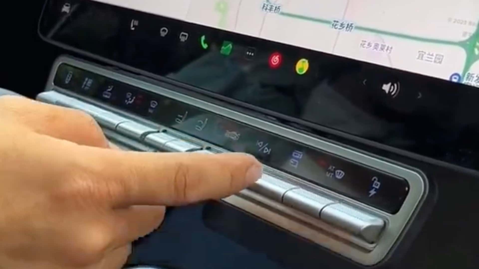
Tesla Model X Owner Has Had Enough Of Minimalism, Adds Physical Buttons::Tesla Model X owner from China has attached a panel of physical buttons to the vehicle’s main control unit for quicker access to some key functions.


It absolutely is fucking dangerous, and annoying.
My Model 3 has both the best and the worst interfaces haha.
The column shifter I absolutely love because I don’t have to look at it to use it and it doesn’t take up space on my center console.
The scroll wheels similarly do not require eyes and can be used to control various operations based on context.
But I also have to take my eyes off the road to adjust the temp, seat/steering heaters, and have to go like 3 menus deep to get to the rear seat heaters (passengers can’t control them). Most notably, headlight and wiper controls only have virtual buttons and are hidden in a menu instead of being readily available on screen.
There’s the whole “mind of car view” that consumed 1/3 of your screen real estate, and is super cool for the first couple days of driving but after that it’s just a giant waste of space that could be used for these necessary controls.
I really have a love/hate relationship with this car.