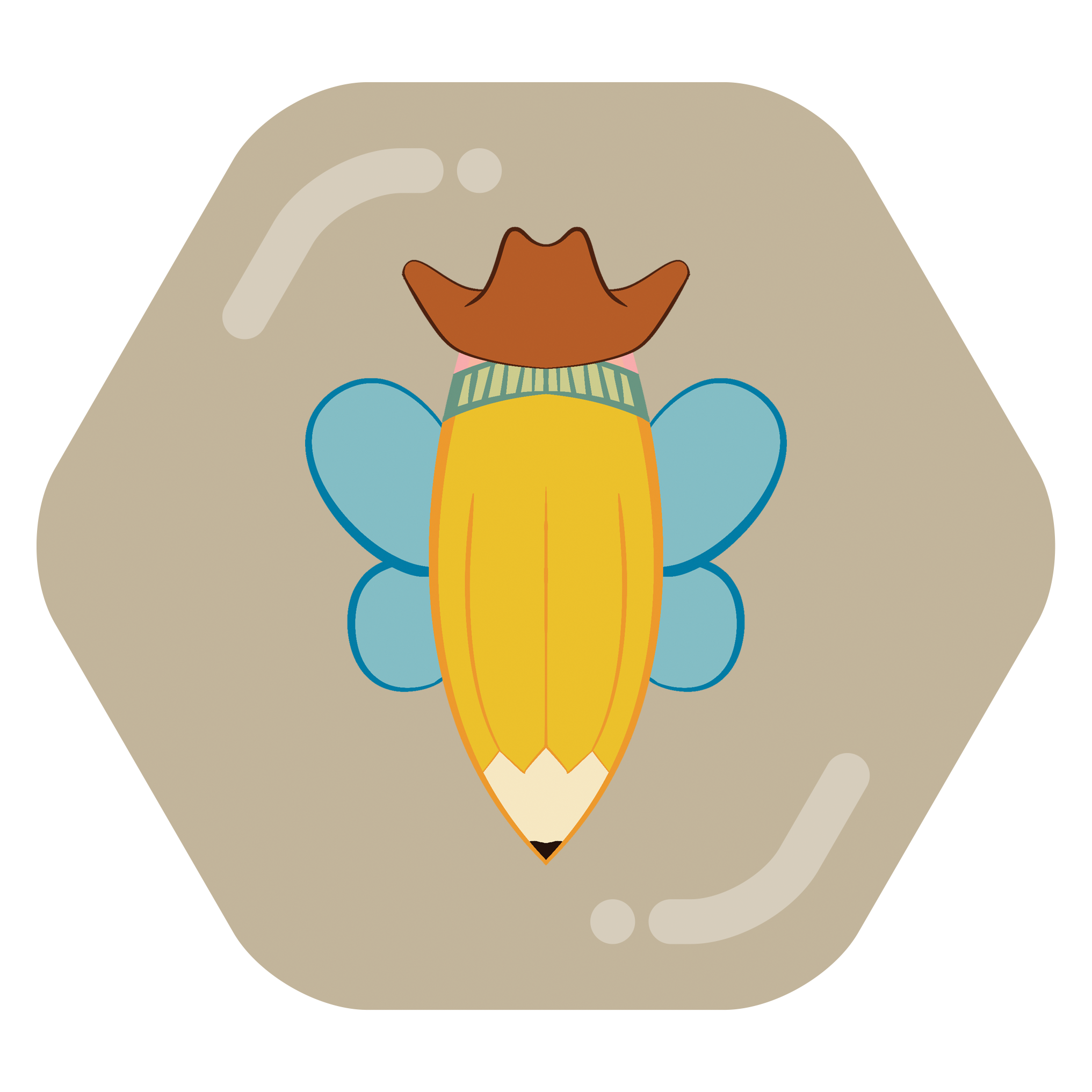

I thought it might be fun to have the community icons lean into the beehive theming, so I made some mock-ups as a proof of concept of how they could look. I also made a logo with a more simplified bee and more of a cowboy motif
I thought it might be fun to have the community icons lean into the beehive theming, so I made some mock-ups as a proof of concept of how they could look. I also made a logo with a more simplified bee and more of a cowboy motif
Woah these look really nice! They feel like they “pop” better and more visually distinguish it being a beehaw community as well!