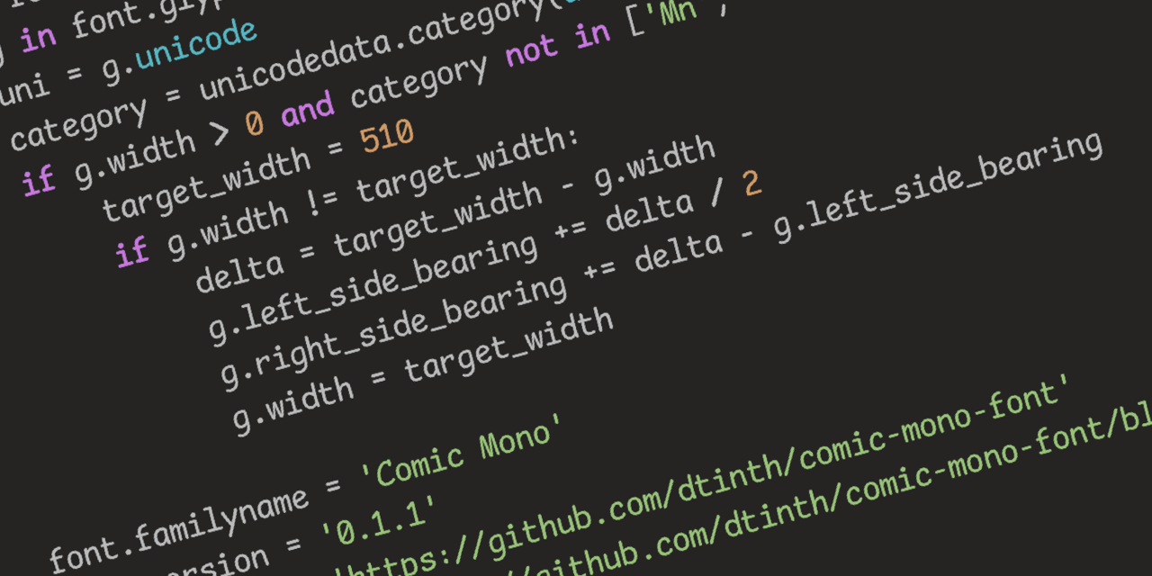
Seriously, though, Comic Sans was originally designed to be legible at the smallest possible font size, and the lack of hard lines makes it easier to read!
I…don’t hate it? Why am I not horribly offended by this?
I feel the same way. I hate that Iike it and am now going to try it.
Same thoughts here. Went in expecting to hate it instantly and found that it sort of looked nice.
I think some of the reason might be that Comic sans used to have really bad kerning. But with a mono font it is not really an issue.
Yeah, this has me intrigued. May try it out in vscode just for a lark. Possibly actually will be easier to read with some nice shapes…
This has me rethinking like two decades of coding. wtf.
Oh no, I was ready to pick up my pitchfork, but that is super legible. Brb, I need to go take a look at myself in the mirror…
Definitely makes sense considering some dyslexic people have found it helpful in terms of legibility
Yep, it shares a lot of characteristics with fonts like Dyslexie, but without some of the more irritating (but helpful) gravity additions that throw off non-dyslexic readers and/or just look odd.
The additions throw off some dyslexic readers too, I’ve always had an even harder time reading purpose-built dyslexia fonts. Comic mono is top tier for me, it still looks stupid but the readability is incredible.
Friendship ended with font gatekeeping and dogpiling, accessibility is my new best friend
Whoever owns this whole server can you ban this guy. This is a crime to humanity
I love Comic Mono. I use Comic Code - it’s not free but it does support ligatures, which was worth it to me. The legibility boost is excellent.
I came here to get mad but comic sans monospaced looks really good. I’m impressed. I might switch my IDE to this.
Yeah but does it have ligatures? That’s my hard pass on coding fonts.
Looks to me like it has a ligature that visually appears as two separate characters but are spaced to be close together. See the
<=in the code examples on the page.
Reducing the font-size makes it look pretty great.
I run my real thoughts through a filter of chatgpt with instructions to make it work appropriate, edit font to comic sans, then vary the grayscale of each individual character before I send out emails to people I hate.
A dude posted his neofetch on a Linux community and he uses fucking comic sans for his terminal. Probably will rot in hell
Every PR you make is going to be denied.
I don’t care it shows up as my BitStream Sans Mono, I know you write in comic sans, DENIED.
Tough, but ultimately fair
That looks sooooooo nice
Who knew? Just make it monospace.
Fantasque Sans Mono
Haha, this is one and only one thing in my life that I don’t want to change, never ever :D
Staring at code for 8 hrs a day, my eyes thank you.
pfft! Real devs use wingdings!
I’m going to try this after trying Intel’s new font that’s supposed to be made to accommodate for vision impairment.
It’s really weird to me how Internet sometimes decide to hate on things just for the sake of it.
I wouldn’t be using it myself, because I’m not a fan of hand-written style fonts. But, I see no problem with Comic Sans.I mean Comic Mono is mentally relaxing and ligible so great font of choice

