You must log in or register to comment.
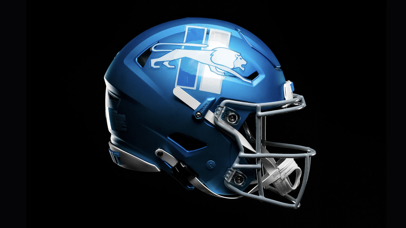
I love the color and texture, but the Lion logo looks so incredibly amateur. Simple, but not clean. And the two rectangles behind it for no reason are just… Baffling.
And on my second look I realized they are using both white and silver, and the rectangle on the right is white outline with silver fill. I think that’s part of what makes it so messy looking.
The rectangle on the right seems to have a darker blue fill than the rest of the helmet, though that could just be the picture. And that clashes not only with the background but the outline of the line. I think the whole thing would look better if they just chose silver or white and used that for everything.
That logo is so ugly it’s good. Seriously.
Unironically like it


