There’s two things that I miss from my current reddit frontend:
- The density of posts. Lemmy feels sparse. Most of the UI is empty on my 16:9 monitor. I would like to have the equivalent to reddit’s classic layout, where the sidebar is all the way to the right, and content has no padding before/after it. Everything in blue is dead space.

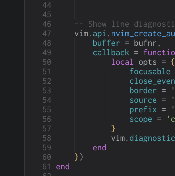
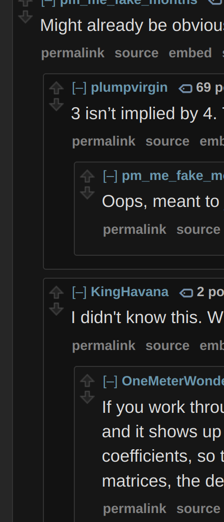
- Comment nesting is kind of hard to follow. I suspect that this is because lemmy currently visually indents comments, but does not have indentation guides that extend below the current comment. Compare the following nesting visuals (the second is from old reddit, the first is from a text editor):


With a lemmy thread:

Notice how the red line does not extend all the way down to the bottom of the yellow line. I think that’s much more difficult to follow than if it did. If, say, the toplevel comment were above the visible screen, we would not know how nested the comment we are reading is on first glance. A reader would be reliant only on color (which is also bad for accessibility reasons) to understand how nested a comment is, instead of receiving a coarse estimate from the number of vertical lines preceding a comment.


I just made https://lemmy.ml/c/computerscience for the academic discussion of theoretical computer science and algorithm design.