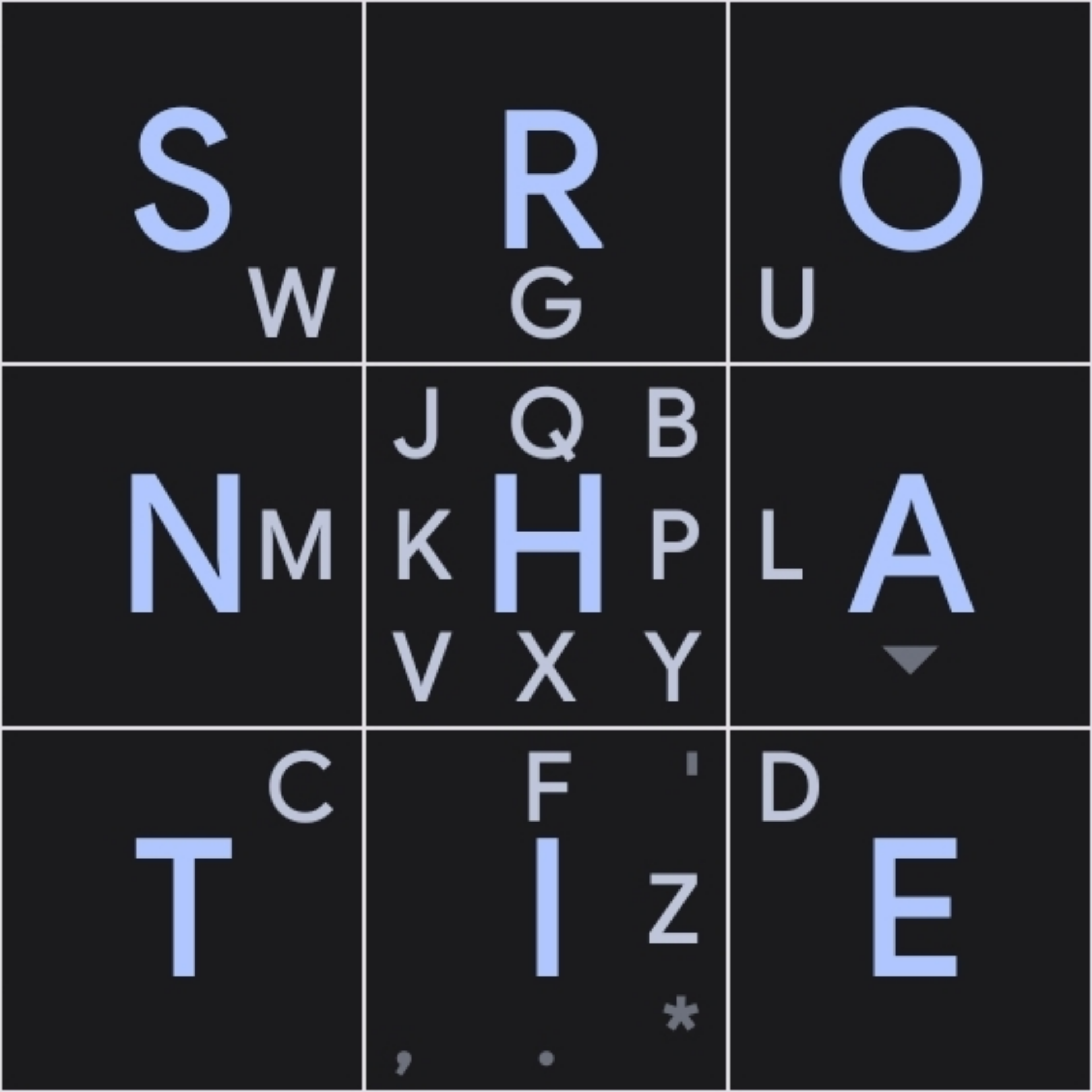
MessagEase designed it’s layout with one thumb in mind, go for the og
- 0 Posts
- 12 Comments
I love this. Almost as much as using runit as my init system
Same, I enjoyed being able to pick and choose what character appeared where on messagease, if at all. Also holding a letter to get the number “below it” was pretty neat
W movie, W post

 2·1 year ago
What a thing the internet is

 1·1 year ago
It’s funny to me how everybody on the 40% ergo (maybe split) train wants/likes exactly the corne, but with more pinky stagger
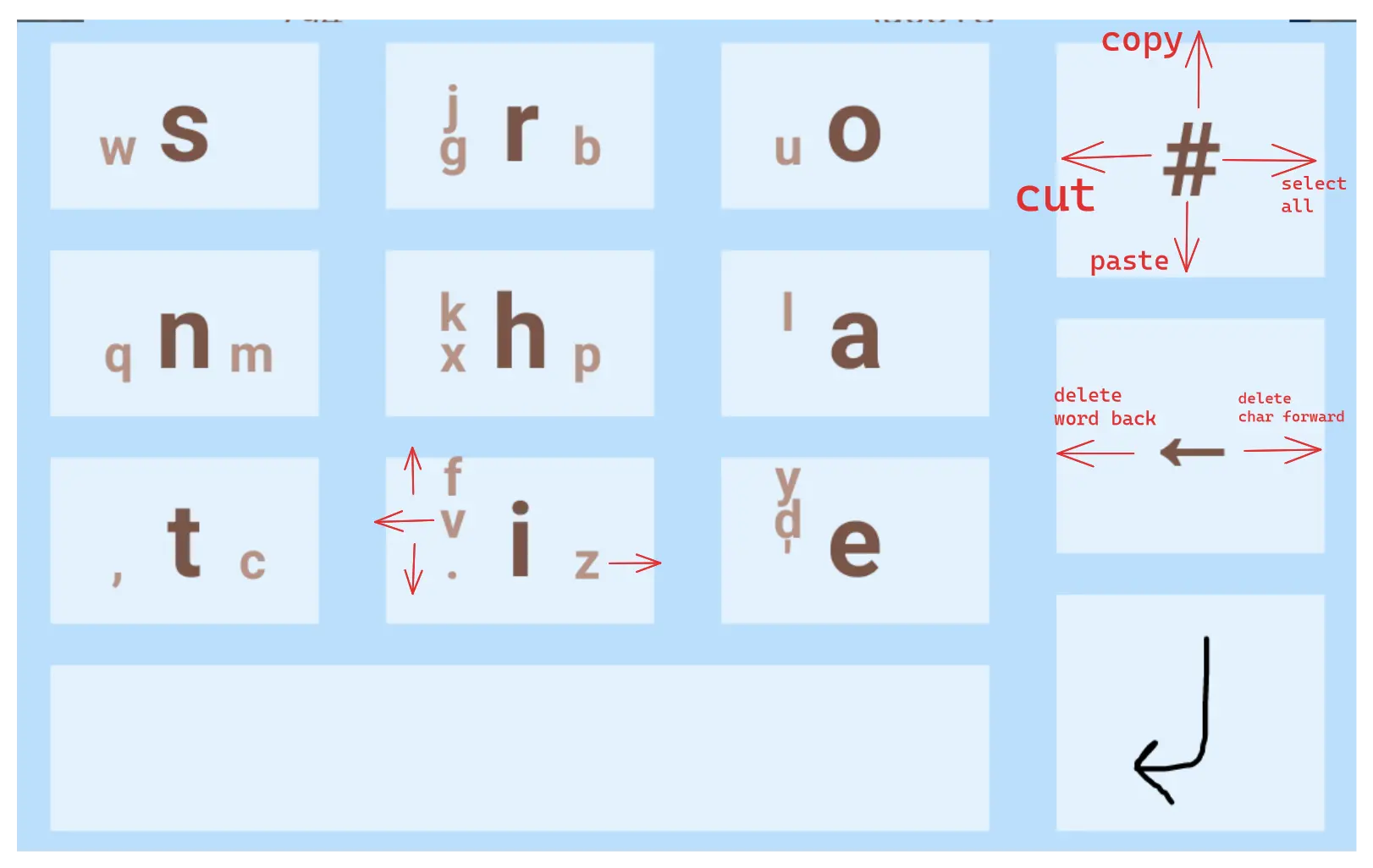
I’d love to help you iterate a layout based on your B point. I made one based on those ideas with Keyboard Designer and definitely noticed improvements over the original MessageEase layout, but I’d like to get your input too.

That’s the layout I made. I took Dvorak as a starting point, then applied your ideas where I saw fit, and later swaped a few keys around. Holding
#opens the keyboard settings btw. I find it a lot better to have larger backspace, symbols and enter keys than having a dedicated settings key (that I accidently press way too often in Thumb-Key)Bear in mind Keyboard Designer doesn’t allow actions on diagonal slides, so that’s why you might notice them missing

 1·1 year ago
Nice IEMs lol
As a 40% keyboard user, I find amusing that a full size keyboard in disguise gets called “portable”
Nice keeb tho :)

 3·1 year ago
Halo Reach. Every time I replay it, it hits harder.

 2·1 year ago
Fellow dvorjack user ;)


Slow af but comfy