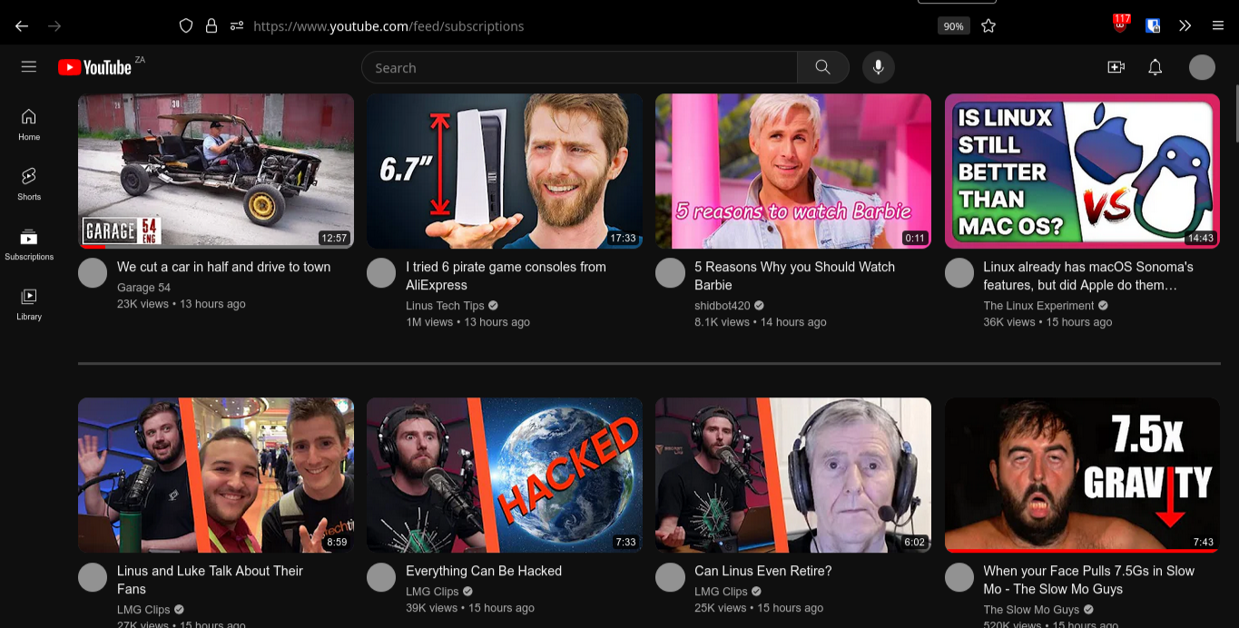
I prefer “list” view over grid view. Switching to grid view shows six videos before the break, but significantly less information about the video.
God, Youtube has gone to shit lately.
Lately in this context, meaning about the last 15 or so years.
They added sort from oldest back! wooooooo. One step forward after being launched backwards into a pile of shit.
They only removed it because it interfered with a new feature they added to the mobile app. If they removed it for monetary reasons (like what they did with dislikes), they wouldn’t have brought it back
I don’t give a cunt’s dick why they removed it in the first place, why are you defending anything about it
I’m not defending anything. I think you misunderstood my comment
uBlock Origin makes this easy:
Instructions Screenshot 1. Find a Shorts section on the page 
2. Select the element picker in uBlock Origin 
3. Select the Shorts section 
4. Click “Create” 
5. Enjoy 
You can also use the “zap” feature. Just use the lightning bolt icon to the left of the eyedropper and it’ll skip step 4. I also found this to work better because selecting shorts ended up always selecting the entire videos section as well.
This is just temporary, if you refresh the page it will show section again.
It was not temporary for me. I had to go into my settings and delete my changes to get it working again.
This is defined as temporary in uBlock documentation.
Reloading the web page will cause all removed elements to return.
Your link talks about the element zapper, the icon that looks like a lightning. The instructions above talk about the element picker, the icon that looks like an eye dropper.
You can also use the “zap” feature. Just use the lightning bolt icon to the left of the eyedropper and it’ll skip step 4. I also found this to work better because selecting shorts ended up always selecting the entire videos section as well.
Unfortunately zapping doesn’t work after refreshing
I would recommend clicking Preview before Create. You know what will be removed before creating a rule is better.
Some more filters for blocking Shorts from YT can be found here.
There are pre-made filterlists that deal with annoyances like this (which tend to end up more reliable as tools that randomize/minify CSS classes get widely adopted), not just on YT but the wider web as a whole. I’ve written about how to set them up here: https://blahaj.zone/@ShittyKopper/pages/usable-web if you want to take a look at it
This is a great resource, thank you very much!
Wow cool feature!
OMG thank you ☺️
Does this work consistenyl? I tried that with Pinterest’s login popup and it doen’t work (the element changes every time you enter the site). I ended up adding a filter to remove all Pinterest results from all my searches.
I can’t thank you enough.
I did this years ago when it was added to home, not seen shorts since. Good guide.
You can hide segments like that with ublock, fwiw. It’s been really useful to me for these kinds of changes every single website seems to be pushing these days.
The new slider replacement.
I found youtube in particular to use very generic functionq that are used in other places so blocking something small ends up blocking other things, iirc from the long time ago that I wasn’t using piped, blocking youtube premium prompt broke comments or something along those lines
Also with a browser extension. Wikihow has a page on how to do it 5 different ways.
yep, I use this on Firefox currently
Added and thank you!
I dont know where I have it from (I think somone on reddit posted it), but I use this in the uBlock Origin Filter since 8 month and it removes all my shorts from the subscription:
www.youtube.com##ytd-guide-renderer a.yt-simple-endpoint path[d^="M10 14.65v-5.3L15 12l-5 2.65zm7.77-4.33"]:upward(ytd-guide-entry-renderer)
www.youtube.com##ytd-mini-guide-renderer a.yt-simple-endpoint path[d^="M10 14.65v-5.3L15 12l-5 2.65zm7.77-4.33"]:upward(ytd-mini-guide-entry-renderer)
www.youtube.com##ytd-browse #dismissible ytd-rich-grid-slim-media[is-short]:upward(ytd-rich-section-renderer)
www.youtube.com##ytd-browse[page-subtype="home"] .ytd-thumbnail[href^="/shorts/"]:upward(ytd-rich-item-renderer)
www.youtube.com##ytd-browse[page-subtype="subscriptions"] .ytd-thumbnail[href^="/shorts/"]:upward(ytd-grid-video-renderer,ytd-rich-item-renderer)
www.youtube.com##ytd-search .ytd-thumbnail[href^="/shorts/"]:upward(ytd-video-renderer)
www.youtube.com##ytd-watch-next-secondary-results-renderer .ytd-thumbnail[href^="/shorts/"]:upward(ytd-compact-video-renderer,ytd-shelf-renderer)
www.youtube.com##ytd-watch-next-secondary-results-renderer ytd-reel-shelf-renderer
www.youtube.com##ytd-browse[page-subtype="subscriptions"] ytd-video-renderer .ytd-thumbnail[href^="/shorts/"]:upward(ytd-item-section-renderer)
www.youtube.com##ytd-browse[page-subtype="channels"] #contents.ytd-reel-shelf-renderer:upward(ytd-item-section-renderer)
www.youtube.com##ytd-browse[page-subtype="trending"] .ytd-thumbnail[href^="/shorts/"]:upward(ytd-video-renderer)
www.youtube.com##ytd-search #contents ytd-reel-shelf-renderer
m.youtube.com##ytm-reel-shelf-renderer
m.youtube.com##ytm-pivot-bar-renderer div.pivot-shorts:upward(ytm-pivot-bar-item-renderer)
m.youtube.com##ytm-browse ytm-item-section-renderer ytm-thumbnail-overlay-time-status-renderer[data-style="SHORTS"]:upward(ytm-video-with-context-renderer)
m.youtube.com##ytm-browse ytm-item-section-renderer ytm-thumbnail-overlay-time-status-renderer[data-style="SHORTS"]:upward(ytm-compact-video-renderer)
m.youtube.com##ytm-search ytm-thumbnail-overlay-time-status-renderer[data-style="SHORTS"]:upward(ytm-compact-video-renderer)
m.youtube.com##ytm-single-column-watch-next-results-renderer ytm-thumbnail-overlay-time-status-renderer span:has-text(/^(0:\d\d|1:0\d)$/):upward(ytm-video-with-context-renderer)
It will sure break in a couple of month again. It did 8 Month ago and I am sure YT will change the code again at some point.
I do not trust having to many FF Extensions installed from some rando from the Internet, so I like this solution better.
I don’t mind shorts so much but Enhancer for Youtube has the ability to convert shorts to regular videos or hide them.
But the Videos are still only 1 Minute long. I find them a disgrace for my attention span. Before shorts/tiktok people were already arguing how deep a video of 10 Minute really can be and might be giving only a shallow idea of a topic. Going even further down to 1 Minute per topic is too much (less) for me. I prefer videos 20 Minutes+. Mostly 45-60 Minutes hit a decent spot for me to feel like I learned something about a topic. A couple of days ago I watched a 2-parts video of 6h and 5h (over several days) about the Russo-Japanese war. And even that was skimming over a lot of topics (obviously) but afterwards I felt like I understood something. I dont know how a 1 Minute short can transport anything other than just “a feeling of knowledge” - at this point it is basically just entertainment. I already felt 10 Minutes was snack-infotainment short. 1 Minute clips leave me behind like eating candy for dinner: Very unsatisfied. And maybe that is the reason people then click the next tiktok/short, because they actually do not feel satisfied by such a short clip and have the feeling for wanting more. And they satisfy this “more” by switching to another 1-Minute video. Again getting the feeling of more, yet getting less in the end of the day.
Any chance you can drop a link to 11 hours on the Russo-Japanese war? Didn’t even know that was a thing
Sure. Here you go: Part 1, Part2, (there even is a third part) - I strongly advice to watch it on 1.5x, as the speaker is very slow
I liked the very detailed day-by-day turns in the first part as well as the epic sea-fights in the second part. Also the small biography-slides with detailed vitaes of military personal gave a good idea in what time people lived and where they were going. Combined with an endless stream of original photos and drawings of the fights, it was a very dense documentation and gave a good image about war, russia, japan and the though-process of early 20th century military tactics.
Here is an alternative Piped link(s): https://piped.video/watch?v=vqdBOxKq-L4
https://piped.video/watch?v=8StilK0RWW0
Piped is a privacy-respecting open-source alternative frontend to YouTube.
I’m open-source, check me out at GitHub.
Not even that comical story about the misadventures of the Russian Navy? Oh man, you’re really missing out!
Here are a couple of videos about it:
- <10-minute video by BlueJay (presented in a casual/funny/meme-y way)
- >40-minute video by Drachinifel (presented in a serious documentary kind of way)
If you’ve got 50 minutes to spare, it’s worth watching both.
Here is an alternative Piped link(s): https://piped.video/watch?v=yzGqp3R4Mx4
https://piped.video/watch?v=9Mdi_Fh9_Ag
Piped is a privacy-respecting open-source alternative frontend to YouTube.
I’m open-source, check me out at GitHub.
Hey bot, you missed the fact that there were two videos linked in that comment.
True but also to be fair I have attention issues and can’t really sit too long for a whole video but they’re good for a lot of little critical role clips!
Then again I’m on like Tiktok all the time so I’m used to it :3
I think (if it is not a disorder) attention span can be trained. It takes discipline and a true interest into a topic other than just a vague excitement. If you are able to state what topics you are interested in for yourself, you might be able to concentrate on 10-30 Minutes of the same topic. People who are really into The Kardashians are able to watch a whole 50 Minute episode of them. So it is not the problem of concentration for them, it is more that they need something put in front of them for that they can feel a passion or enthusiasm they deeply care about - even it is just The Kardashians. Here is the thing: People have no problem browsing 2h+ of tiktok, but can not concentrate on 10x 20min video? I think if you have a real interest in something you can get through longer videos. Do you look for thing you really care about or do you actively looking for a distraction when you browse tiktok? It is not a bad thing to use it that way. After a long day of work, it can relax your brain browsing real shallow, short clips. But daily, in high doses… then I think it is maybe another reason people do it (escapism, etc.)
Can you share the videos about the war? They sound interesting.
path[d^=“M10 14.65v-5.3L15 12l-5 2.65zm7.77-4.33”]
Some of those rules are OK, but the
pathrules will be pretty flaky since they’re relying on a particular shape (like an icon or something) being present on the page.I dont know where I have it from
Maybe from here: https://letsblock.it/filters/youtube-shorts
I really think i got it from a Reddit comment, but it is good to know the source of it. Thank you.
I will also recommend blocktube extension.
Anyone using Arc who needs a boost to block all YouTube bloat, let me know. I created one for myself but haven’t submitted it to the gallery. It hides shorts, suggested search results and some other crap.
Also DeArrow extension is really good for removing the clickbait thumbnails and replaces them with a simple still from the video itself. It also removes Emojis and special characters from the titles.
Other essential extensions for YouTube for me are (1) sponsorblock and (2) enhancer for YouTube.
I dunno when it happened but there was a time before clickbait and in-video ads. That was the good time.
Newpipe. Libretube Free tube
I just hate how much functionality the Shorts player loses compared to the regular Youtube player. They seriously made their product worse to imitate a competitor? Who asked for this?
The shareholders.
I swear that these board of director types are some of the most dense and out of touch people on the planet. It’s crazy how we reward them for their stupidity in exchange for their unbridled greed.
Checkout the Youtube-shorts-block extension which gives shorts the same UI as normal youtube videos.
Basically what the extension does is replace the parts in the URL youtube.com/shorts/“video-id” to youtube.com/watch?v=“video-id”
Here is an alternative Piped link(s): https://piped.video/shorts/
Piped is a privacy-respecting open-source alternative frontend to YouTube.
I’m open-source, check me out at GitHub.
I think the UX team is banking on user psychology. Majority of users don’t want functionality, they want familiarity. They should feel like they are watching Tiktok.
We should remember that we power users are a minority in social media.
Who asked for this?
Either Susan Wojcicki (ex-YT CEO), Neal Mohan (current YT-CEO) or Sundar Pichai (Google CEO)
And funnily, the shorts player on mobile has some of those features.
I’m afraid it boils down to the significant amount of users, who asked or “asked” for this. Shorts is crazy popular.
Youtube added shorts to subscription, and i added Youtube-shorts block to firefox.
Nice one
Same. They can try as much as they want to make it happen, but if people don’t want it, people don’t want it no matter how much they force them.
Fuck YouTube shorts. It’s infuriating that YouTube doesn’t provide us an option to remove all traces of that fuckin cancer from the platform.
My biggest issue is so many of the people I sub that have shorts, the shorts are their normal videos but only a small clip of it. I dont want that, Im already watching the videos!
deleted by creator
If we wanted short clips, we’d be on TikTok damnit!
Exactly. YouTube doesn’t want to lose out on that revenue/time spent on other platforms…
Press the X? Gotcha! I’ll remove shorts for 30 days or until you come back without cookies in 10 minutes.
I don’t mind YouTube shorts usually, although my TikTok feed is far better. But last week, my YouTube app started opening to the shorts tab. Infuriating. I’ll watch a short if it piques my interest, but that’s not what I’m going to YouTube for.
I hate this format of content so much. An automatically reloading, never ending stream of snippets that are hardly informative even if they try. Fucking looks like they are trying to hypnotize us.
Oh wait, they absolutely are. Stop thinking about not being able to afford a living even though you bust your ass of everyday. Stop worrying about the climate. Get a new iphone and obediently watch citizen.
This is not a defense of TikTok style short form content. It’s just that from time to time, I do enjoy the shorter style videos. Like when I have 5 minutes to kill, watch a few short videos and be on my way.
What I really don’t like is that if you choose the app and the last thing you watched was a short, it opens right back up to to Shorts. Very annoying.
When I have 5 minutes to kill I open Wikipedia and read the article of the day.
Reading is better for your brain and attention span, and on top of that you learn something new.
I should do this more often. Thanks for the suggestion!
Yeah I occasionally use Instagram and look at reels. Sometimes it’s fun to catch the one snippet from a comedy sketch instead of watching the whole thing.
That said, I wouldn’t miss anything if I deleted it tomorrow.
Trying to hop on that ADHD train.
Plus they commit the biggest sin possible in video…VERTICAL VIDEO. I hate this garbage trend of everything being designed for phones. Vertical videos suck. They are terrible to watch on desktop. You can rotate your phone sideways, you can’t rotate your TV, laptop, monitor, projector, etc. vertical (at least not most of the time).
Just add this line to the “My Filters” section for the uBlock Origin extension.
- click the extension in your top bar
- click the “gears” icon/button
- click the “My Filters” tab and add this line :
www.youtube.com###content > .ytd-rich-section-renderer.style-scope
My original mastadon post has screenshots with red guide marks in case this is confusing:
There’s an even more extensive filter list for hiding shorts here: https://letsblock.it/filters/youtube-shorts
Removed by mod
You can use the regular Youtube interface for shorts, I do it everytime I open one:
-
go to a short video
-
replace the
/shorts/part of the URL by/v/ -
??? (trigger warning: old meme)
-
Profit
-
It’s all intentional. They know that overall it increases engagement and that’s all they care about.
Even Instagram and Tiktok let people fast forward videos. YouTube needs to get their shit together.
The zombie clicker demographic is their best customer/product
Laughs in revanced
Laughs in NewPipe
deleted by creator
I may be weird, but I don’t mind the YouTube shorts too much.
It’s like a little taste of the people I subscribe to.
It’s YouTube. I don’t need a little taste. I can just start playing a video and skip around.
I’d be less annoyed at them if I could turn them off.
Since Google keeps trying to shove them down my throat it’s safe to say they exist for Google’s benefit, not mine.
Good thing ublock origin exists, shorts are awful
Depends. It’s a good alternative when you don’t want to follow people on TikTok. Hank and John Green do shorts, there’s a Maine lobsterman who does great shorts, there’s a couple of people who do very funny Heaven/Hell skits…
Nah, they’re awful. Your explanation is like someone saying, “Nazis are awful,” and you saying “Depends. Fritz had me over for dinner and him and his wife are pretty nice, and Hanz is good defense for a game of footie.”
Just because there are exceptions to the rule, doesn’t make the entire format, as a whole, not awful. The idea, right down to its core of being 1) easily accessible 2) quickly digestible and 3) easy to market with turns it into a party where everyone is jumping around saying “Hey, hey! Look at me! Looook at meeeeeee! Please give me your attention!”
This is why 50% of TikTok users surveyed said that videos over one minute long are stressful for them, it’s completely devastated people’s attention spans.
But this still ignores the ultimate cardinal sin of video content: forcing the vertical aspect ratio in order to facilitate easier scrolling, even though OUR BINOCULAR VISION IS OPTIMIZED FOR WIDESCREEN VIEWING.
Easy on the Godwin there, pal.
Fastest and easiest way to get my point across
This is all 100% accurate forever and people that don’t like it are wrong.
Your explanation is like someone saying, “Nazis are awful,” and you saying "Depends.
Are we really comparing YouTube Shorts to Nazis?
I’m comparing two shitty things using hyperbole
Removed by mod
because this is Youtube. If you like shorts that much, go back to Tiktok


