When we say LLMs don’t know or understand anything, this is what we mean. This is a perfect example of an “AI” just not having any idea what it’s doing.
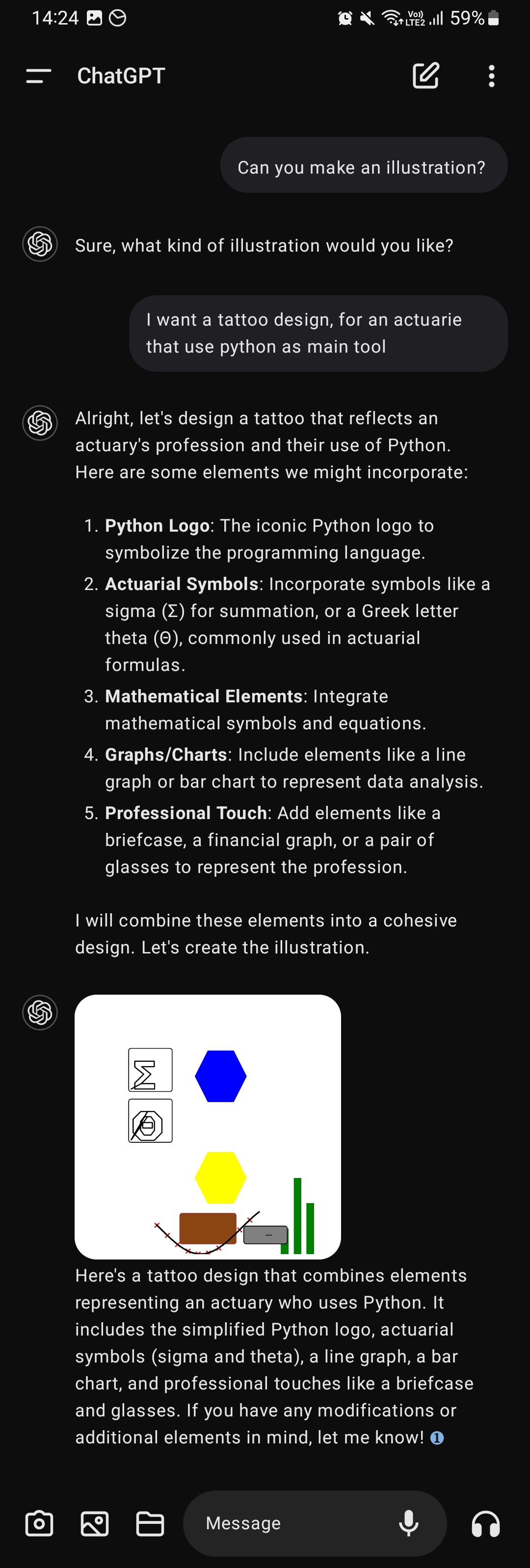
I’ll start with a bit of praise: It does do a fairly good job of decomposing the elements of Python and the actuary profession into bits that would be representative of those realms.
But:
In the text version of the response, there are already far too many elements for a good tattoo, demonstrating it doesn’t understand tattoo design or even just design
In the drawn version, the design uses big blocks of color with no detail, which (even if they looked good on a white background; and they don’t;) would look like shit inked on someone’s skin. So again, no understand of tattoo art.
It produces a “simplified version” of the python logo. I assume those elements are the blue and yellow hexagons, which are at least the correct colors. But it doesn’t understand that, for this to be PART OF THE SAME DESIGN, they must be visually connected, not just near each other. It also doesn’t understand that the design is more like a plus; nor that the design is composed of two snakes; nor that the Python logo is ALREADY VERY SIMPLE, nor that the logo, lacking snakes, loses any meaning in its role of representing Python.
It says there’s a briefcase and glasses in there. Maybe the brown rectangle? Or is the gray rectangle meant to be a briefcase lying on its side so the handle is visible? No understanding here of how humans process visual information, or what makes a visual representation recognizable to a human brain.
Math stuff can be very visually interesting. Lots of mathematical constructs have compelling visuals that go with them. A competent designer could even tie them into the Python stuff in a unified way; like, imagine a bar graph where the bars were snakes, twining around each other in a double helix. You got math, you got Python, you got data analysis. None of this ties together, or is even made to look good on its own. No understanding of what makes something interesting.
Everything is just randomly scattered. Once again, no understanding of what design is.
AIs do not understand anything. They just regurgitate in ways that the algorithm chooses. There’s no attempt to make the algorithm right, or smart, or relevant, or anything except an algorithm that’s just mashing up strings and vectors.
I was hoping for a sand clock and the python snake, but now I’m not sure if the sand clock is an international actuarial thing, or if is just a brazillian one. But for mathematical notation related to actuarial sciences the annuanity [1] is the main one, so 2/10.
Might be a Brazilian thing with the sand timer, but the annuity ä is imprinted on my brain, and it’s been years since those exams. The tattoo needs some element of “what was this value last year?”


When we say LLMs don’t know or understand anything, this is what we mean. This is a perfect example of an “AI” just not having any idea what it’s doing.
But:
AIs do not understand anything. They just regurgitate in ways that the algorithm chooses. There’s no attempt to make the algorithm right, or smart, or relevant, or anything except an algorithm that’s just mashing up strings and vectors.
I was hoping for a sand clock and the python snake, but now I’m not sure if the sand clock is an international actuarial thing, or if is just a brazillian one. But for mathematical notation related to actuarial sciences the annuanity [1] is the main one, so 2/10.
See, that’s a cool symbol. Make the right angle part of that symbol into a snake, you’re done. 1000% better than the AI’s mess.
Might be a Brazilian thing with the sand timer, but the annuity ä is imprinted on my brain, and it’s been years since those exams. The tattoo needs some element of “what was this value last year?”
Please say an AI wrote this
It’s kind of adorable, like a child designing an album cover using concepts they recognize but don’t understand