Stop shaming people about reading kids’ books.
The kids can have those books back when you’re done and not one minute sooner.
Stop shaming people about reading kids’ books.
The kids can have those books back when you’re done and not one minute sooner.
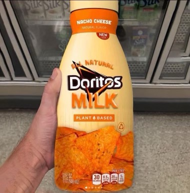
The beans and rice bowls look pretty good, although I’ll bet they’re not spicy enough.
The cheese things… I can’t even figure out what’s supposed to be in there.
All of these things definitely were in the news, of course. They just don’t STAY in the news, and the public memory hole works fast.

What if they do this
deleted by creator
Thanks, I really needed it this time.
Apparently this isn’t how I do network configuration.

deleted by creator

See, that’s a cool symbol. Make the right angle part of that symbol into a snake, you’re done. 1000% better than the AI’s mess.

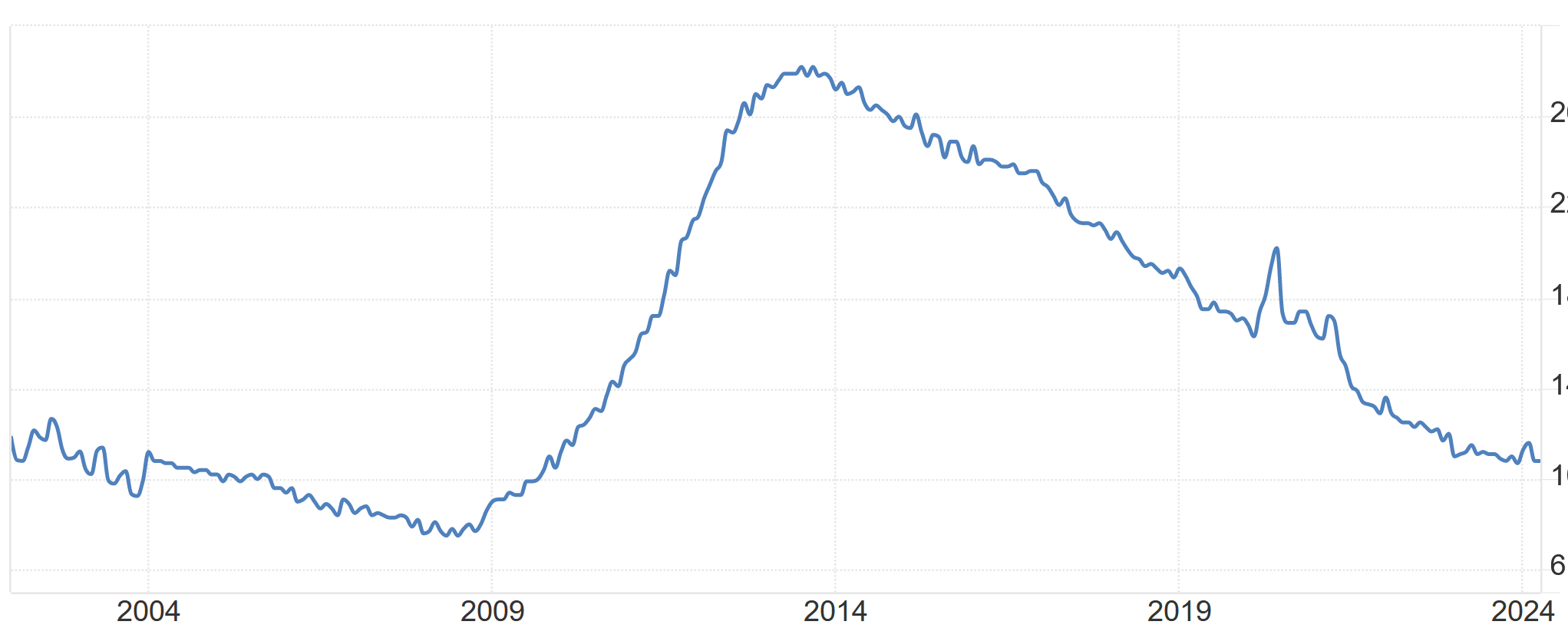
Holy crap it was 28% about a decade ago.
I’d be willing to bet this genius maneuver drives it back up.
Yeah, looking more closely at that graph, I’m noticing it starts in 2009, when Greece had The Crisis: sovereign debt soared thanks to the housing bubble collapse, and people taking a closer look at the actual books of the Greek state. Austerity measures are what led to the massive unemployment spike, and this 6-day work week is another version of austerity.
Austerity doesn’t work. This graph couldn’t be clearer about that fact.
When we say LLMs don’t know or understand anything, this is what we mean. This is a perfect example of an “AI” just not having any idea what it’s doing.
But:
AIs do not understand anything. They just regurgitate in ways that the algorithm chooses. There’s no attempt to make the algorithm right, or smart, or relevant, or anything except an algorithm that’s just mashing up strings and vectors.

IDK Swiss law but I’d still bet they start losing assets quickly if they don’t report to jail.
From what I remember of the Neverending Story (the book), Bastian Balthazar Bux is just some kid with a good imagination, and he ends up as essentially their god; so.

You’re a fucking mod on this sub? Grow up
I mean, they also could have done that this year, or 3 years ago, if they’d had control of Washington. You can actually change any laws you want when you control the lawmaking bodies.

deleted by creator

“So then, what does this dumb idiot do, who is also ugly? He shits his pants, then takes them off and carries them into the police station, naked except for his shitty ass, and turns himself in.”
Checkmate bitch


Damn it’s gonna take me a while to make a whole cup but I’ll get started