In South Korea, 69 percent of adult smartphone users use a Samsung device, while only 23 percent use iPhones, a Gallup survey of 1,001 adults found. But the survey reveals a starkly different trend in one demographic: younger millennials and Gen Z. Among the younger generation, aged 18 to 29, iPhone’s share rises to 65 percent, double the Samsung's 32 percent, the survey found. This represents a 13 percent...

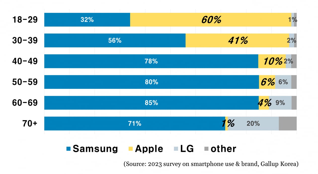
Look at the size the 10% bar is in the 40-49 graph. Then the 6% bars in the 50-59 graph. Then look at the size of the 9% bar in the 60-69 graph. And then the Other bar (8%) in the 70+ graph.
Then go backup and look at the LG and Other bars (8% total) in the top graph. Whoever made this graphic is either intentionally misleading or just plain dumb.
Edit: The 78%, 80%, an 85% bars are also all exactly the same size. It just gets worse the longer you look at it.
Why not both
Yea, it’s strange - top to bottom rows sum up to 94, 100, 92, 94, 100, 100