i’m not even sure it’s worth having an option. i don’t think i’d even have noticed a difference, apart from the menu button being in a slightly different place to every other gnome app. it’s fine; but it wasn’t worth the development time
The last thing I want is an option for this. My gosh, imagine the amount of options you would end up with if every single design choice was turned into an option. Who in the world would like that many options.
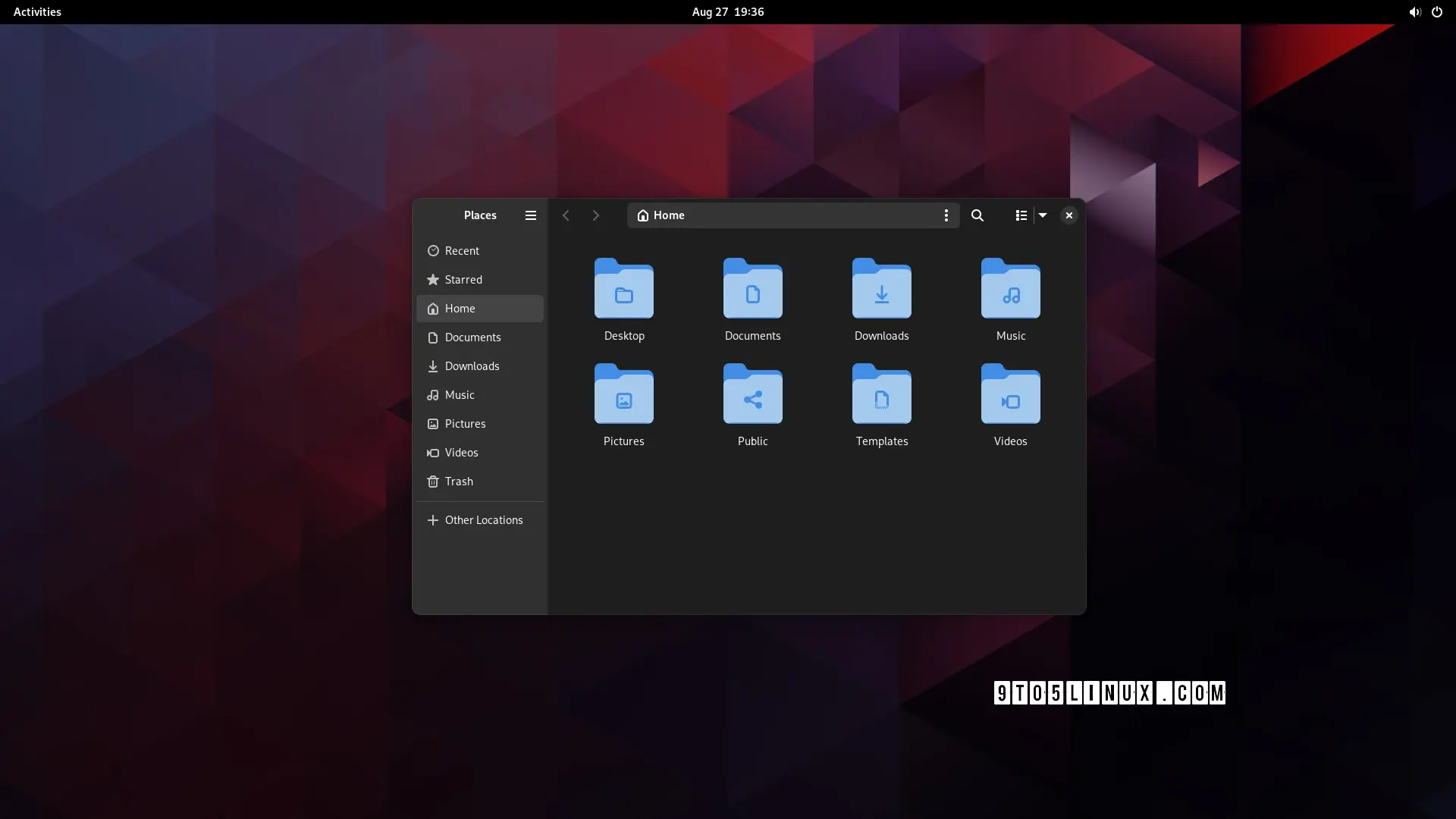
I’m happy to just have a design team work on whatever they think looks better and works best for the user experience, and implement it after some rounds of public review and testing. This looks neat enough to me - slightly less cluttered than what my current Nautilus window looks like while maintaining the same functionality.
Seriously, I envy you guys. Every time I try to use Plasma, I end up spending all my time tweaking the desktop, and by the time I’m done, I realize I’ve just recreated the Gnome workflow…
I found it rather laggy. Maybe I should give it more of a chance just felt clunky and laggy to me (I assume because it’s superimposed ontop of GNOME not integrated into it)
Edit: I gave it another chance and I actually really like it thank you for calling me out on that
Think it was only clunky because I already had a bunch of stuff open before turning it on
I had to look up Fitts’s law, and I’m not sure I get it. Could you explain what you mean?
ETA: I kinda feel like mine was about KDE not being a fit for me personally, and yours was a slam on Gnome rather than a statement of personal preference.
I had to look up Fitts’s law, and I’m not sure I get it. Could you explain what you mean?
basically; the speed that it takes to click a button is dependant on the size of the button and the distance from the cursor. however, buttons at the edge of the screen have effectively infinite size, as they can’t be overshot. the most used actions should be placed there, as they are the easiest to click by muscle memory (particularly the corners, as they have infinite size in both dimensions)
on windows, kde, cinnamon, etc.; by default the bottom left is start, the bottom right is show desktop (this one i can’t explain), and the top right is close maximised window. the top of the screen is also used for other window-related actions like minimise, restore, change csd tabs, etc.
gnome flouts this by having most of the top of the screen doing nothing (most of it is completely empty) apart from rarely used actions like calendar and power. and the bottom right and left doing nothing[1]
did i explain well?
ETA: I kinda feel like mine was about KDE not being a fit for me personally, and yours was a slam on Gnome rather than a statement of personal preference.
nah it was very much a personal thing: some people like having a minimal and clutter-free feature set; i like having as many features as possible, because then i find features i didn’t even know i liked.[2]
as for the top bar: this one confuses me - it just seems objectively bad. but obviously it’s not as some people clearly like it. i haven’t had anyone actually explain to me why, though
I personally love the feature set of Gnome, but I can see your point. Compared to other DEs, it might seem like a lot of wasted space. And I guess in a way it is, but I don’t miss those other functions.
The top right corner doesn’t even need a click to go to overview, which brings up my desktop view and the app launcher - that’s the bottom left and bottom right functions you described in one place, which makes sense to me since in my head they’re related.
The top right is still close maximized windows, but because of the way the Gnome workflow is structured, I don’t really use minimize basically ever, so I don’t miss it. Also in the upper right we have volume control and battery feedback.
I never have more virtual desktops than I’m actually using. Everything is exactly where I expect it to be. My brain is wired for the Gnome workflow, and extra options justbatent needed.
I’ve used Dolphin’s terminal in file manager thing, and while I can see the utility, I prefer my right-click -> open in Console setup. That’s just me, though.
Eh. It takes all kinds to make the world go round, I guess. FTR, I am a huge fan of the KDE project. Their contributions to the Linux world are massive and cannot be overstated. Krita alone is amazing, and I used calligre as my main office software for a few years.

i’m not even sure it’s worth having an option. i don’t think i’d even have noticed a difference, apart from the menu button being in a slightly different place to every other gnome app. it’s fine; but it wasn’t worth the development time
The last thing I want is an option for this. My gosh, imagine the amount of options you would end up with if every single design choice was turned into an option. Who in the world would like that many options.
I’m happy to just have a design team work on whatever they think looks better and works best for the user experience, and implement it after some rounds of public review and testing. This looks neat enough to me - slightly less cluttered than what my current Nautilus window looks like while maintaining the same functionality.
KDE fans?
Awww, Plasma fans, you know I’m playin’.
yep, that’s me
Seriously, I envy you guys. Every time I try to use Plasma, I end up spending all my time tweaking the desktop, and by the time I’m done, I realize I’ve just recreated the Gnome workflow…
I tried KDE, it’s cool but I get the same thing of trying to recreate gnome/pantheon
It kinda sucks in GNOME when there’s just one thing you would like to change though
Have been trying to get a tiling window manager on GNOME but all the gnome extensions that do it kinda suck
Really? I’m not a tiling WM kinda guy, but I thought Forge was decent.
I found it rather laggy. Maybe I should give it more of a chance just felt clunky and laggy to me (I assume because it’s superimposed ontop of GNOME not integrated into it)
Edit: I gave it another chance and I actually really like it thank you for calling me out on that
Think it was only clunky because I already had a bunch of stuff open before turning it on
every time i try to use gnome, i end up spending all my time going “dammit, where are all the bleeding features”
(also the lack of fitts’ law adherence due to that pointless bar at the top)
I had to look up Fitts’s law, and I’m not sure I get it. Could you explain what you mean?
ETA: I kinda feel like mine was about KDE not being a fit for me personally, and yours was a slam on Gnome rather than a statement of personal preference.
basically; the speed that it takes to click a button is dependant on the size of the button and the distance from the cursor. however, buttons at the edge of the screen have effectively infinite size, as they can’t be overshot. the most used actions should be placed there, as they are the easiest to click by muscle memory (particularly the corners, as they have infinite size in both dimensions)
on windows, kde, cinnamon, etc.; by default the bottom left is start, the bottom right is show desktop (this one i can’t explain), and the top right is close maximised window. the top of the screen is also used for other window-related actions like minimise, restore, change csd tabs, etc.
gnome flouts this by having most of the top of the screen doing nothing (most of it is completely empty) apart from rarely used actions like calendar and power. and the bottom right and left doing nothing[1]
did i explain well?
nah it was very much a personal thing: some people like having a minimal and clutter-free feature set; i like having as many features as possible, because then i find features i didn’t even know i liked.[2]
as for the top bar: this one confuses me - it just seems objectively bad. but obviously it’s not as some people clearly like it. i haven’t had anyone actually explain to me why, though
i mean they also ignore it in other ways, too ↩︎
i didn’t know how useful a terminal embedded in the file manager would be until i started using dolphin, now i can’t do without it ↩︎
@Zeus @s20 wow this is interesting and makes perfect sense.
I really like GNOME and the functionality I use the most is the top left overview. Incredibly useful and easily accessible.
GNOME really should use the other 3 corners.
Yes, thank you!
I personally love the feature set of Gnome, but I can see your point. Compared to other DEs, it might seem like a lot of wasted space. And I guess in a way it is, but I don’t miss those other functions.
The top right corner doesn’t even need a click to go to overview, which brings up my desktop view and the app launcher - that’s the bottom left and bottom right functions you described in one place, which makes sense to me since in my head they’re related.
The top right is still close maximized windows, but because of the way the Gnome workflow is structured, I don’t really use minimize basically ever, so I don’t miss it. Also in the upper right we have volume control and battery feedback.
I never have more virtual desktops than I’m actually using. Everything is exactly where I expect it to be. My brain is wired for the Gnome workflow, and extra options justbatent needed.
I’ve used Dolphin’s terminal in file manager thing, and while I can see the utility, I prefer my right-click -> open in Console setup. That’s just me, though.
Eh. It takes all kinds to make the world go round, I guess. FTR, I am a huge fan of the KDE project. Their contributions to the Linux world are massive and cannot be overstated. Krita alone is amazing, and I used calligre as my main office software for a few years.
I’m just not a Plasma guy. ¯_ (ツ) _/¯
That’s the neat thing. It’s so customizable, you can turn it into another desktop environment.
I mean, almost. I can pull it off on my desktop, but I can’t get the touchpad/touchscreen gestures to work right on my laptop.
Kinda looking forward to Plasma 6 to play around with, though. Might even be enough to get me to switch for a while!