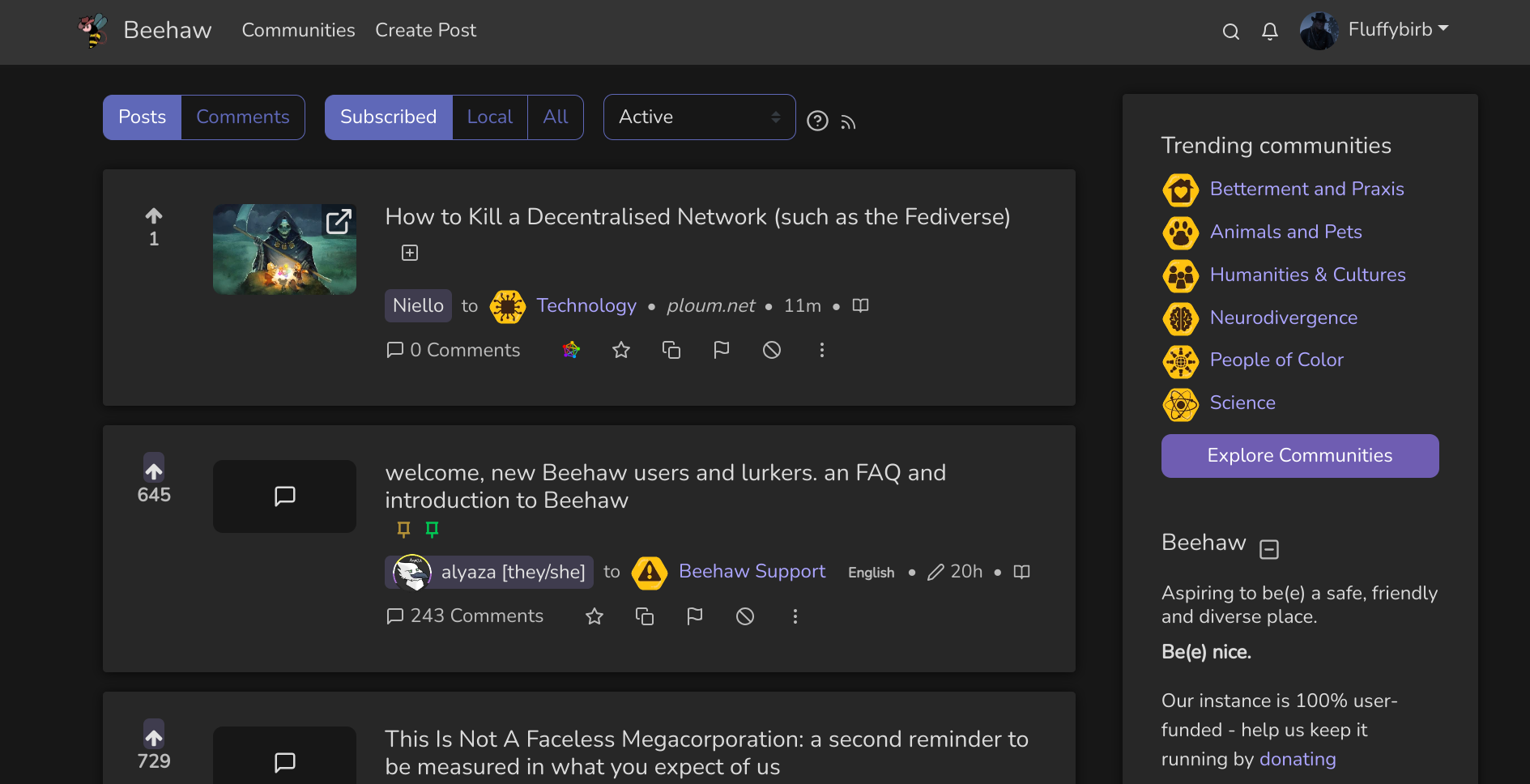
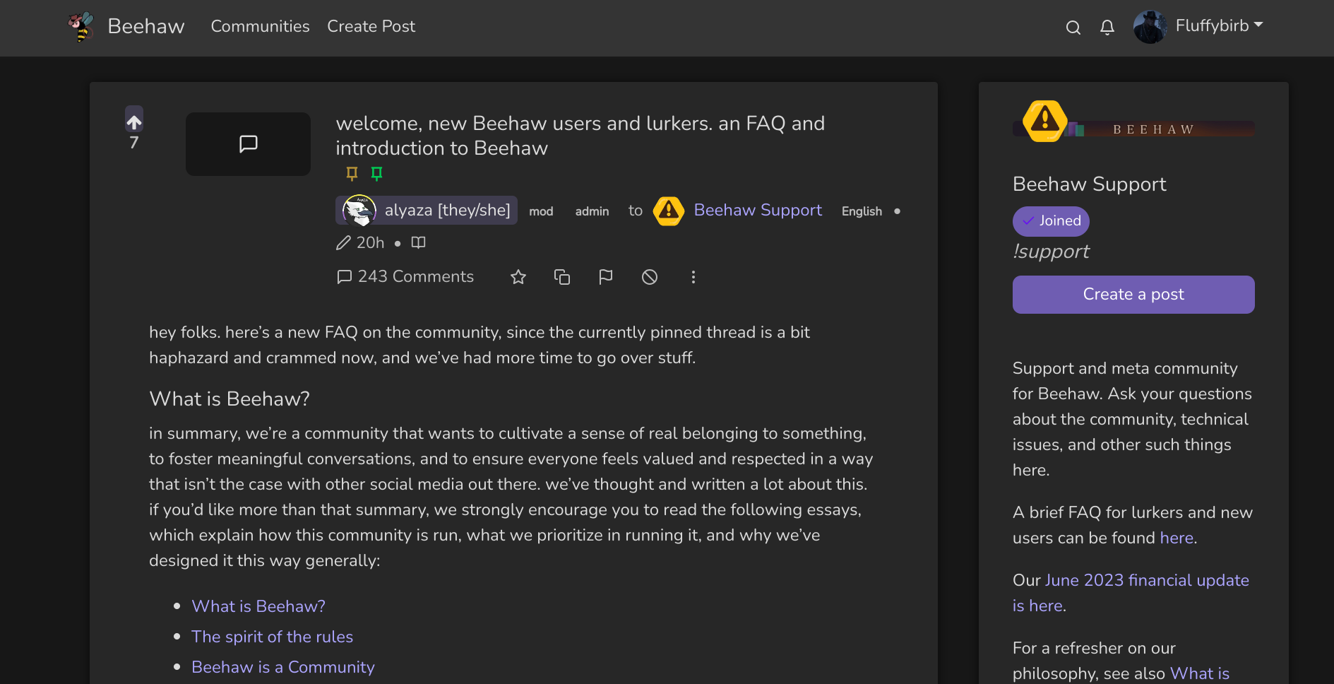
Hi everyone! -waves nervously-
First post!
I just wanted to share the tweaks/customisations I’ve been mucking around with on Stylus for lemmy. :)
I’m not a professional and haven’t properly studied CSS in great detail - only through limited online research, help from developers at work and some osmosis from my job as well. As such, my actual CSS ‘code’, such as it is, is probably a horrifying mess.
However, I’m a very visual person who loves a pretty website and tweaking and customising things and I just can’t help myself sometimes!
It’s been a really good learning exercise for me to try and theme the site, taking into account all the different classes and variations there are. I would need to do a whole lot more work on this to make it viable for anyone other than me (and take into account responsiveness, accessibility etc).
Anyhoo, I kept saying to myself I should try and get over my fear and engage more with the community here so… here we go! I hope you like it as a hopefully vaguely presentable draft :)


Looks very clean ^^
Thank you! _