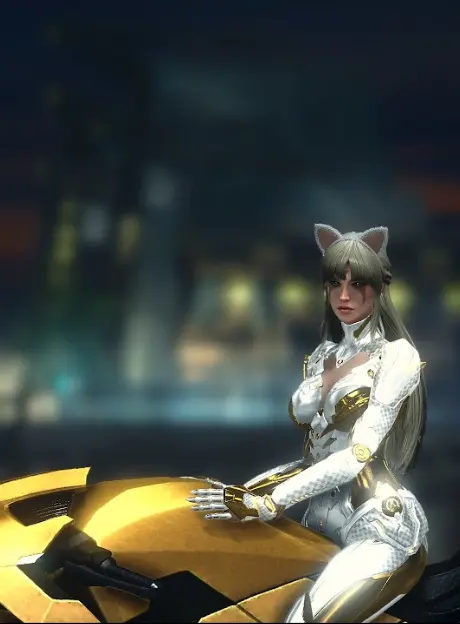
I picked these two images at random from a list without really thinking about the psychology. At least for me, this Outside/Inside > unlock/home combination with SciFi futurism really resonates with me more and more over time.
Do you have any similar coordinated Lock/Home screens?
images used


My lock screen and home screen are coordinated… But only because they are the default image from when I bought my phone 5 years ago
I use the same image for both the lock and home screen.
I’m not sure if I’m a psychopath, or just a very boring person.
I’ve met people who use the default ones and find no problem with it. Those are the true psychopathic ones. Rest easy.
I use the same image. But the Home Screen image is shifted down a bit because iPhone and apps get in the way.
Also I’d say using the same image is much closer to normal than the coordinated set.
I’ve never coordinated my lock screens until I saw these pictures.
Lock Screen
Home Screen

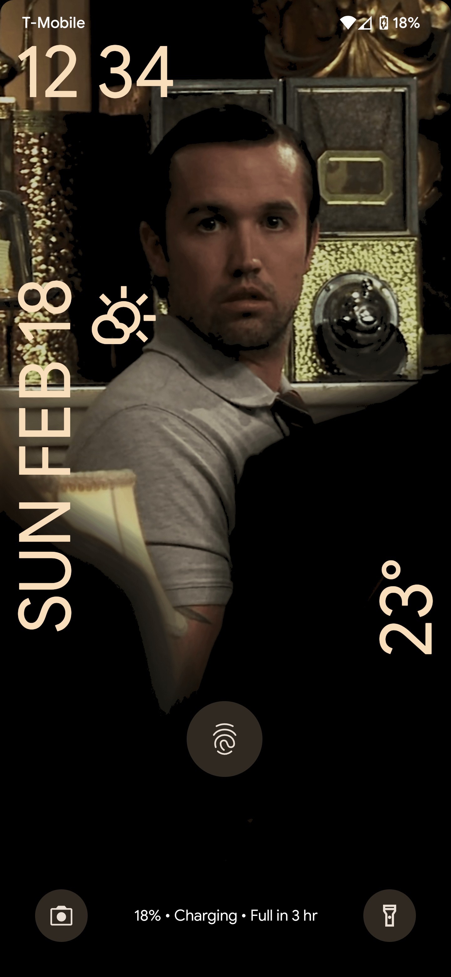
Anyone know how to get your phone to NOT show time like that? It drives me crazy and I can’t find anything in the settings.
Settings > Display > Lock screen > Dynamic clock will make it much smaller.
Removing it entirely is not in default Android 14. I wish it was.
It wasn’t there, but you did sort of lead me to it.
It’s in the clock app settings, setting the screensaver to analog in there makes it shows as 00:00 on one line.Why is “analog” a digital display? Who knows lol but it worked.
deleted by creator
If there’s nothing in settings you might just have to root your phone or install a new OS. I’m no expert though
Eh I’m not going that far. It isn’t that important. Just annoying.
I don’t know if this counts but I’m one of those nutters who has no images on either. Just pure black screens.
Come to think of it, maybe they are images. I remember taking a photo with the lens completely covered for something…
I would like to pick a home screen wallpaper like this but don’t want people staring when in public
I’ve never really thought of coordinating them tbh but it sounds and looks like a neat idea. I’ve always kept the lock and home screen the same but lately I’ve been changing the wallpaper to roughly match the season. So right now it’s a snowy mountains for winter.
I custom-built my home and lock screen. lock screen is hacker green mono spaced type on a black background detailing my serial number, Mac address, model number, IMEI, and a few other details with some decorators to highlight the status bar, lock screen icons, etc
the home screen uses a similar set of dividers with a pink on black colored screens and no phone data
I do this! Lately I’ve been using DALL-E to create two vector art pieces and I flatten the colors using iPhones built-in filters. Works really well. Also apologies to those who will wince at my busy home screen.


Those are beautiful (especially the inside one)! Where did you find them?
I got them from some old shitty link aggregation site that got washed up June 10th of 2023. I used to collect ones I liked and these were on that list.
The space station is from the show “Dark Matter”. It’s a shame it was cancelled after season 3.
I have, with mostly video game or movie wallpaper. I don’t have any examples at the moment, but I prefer colourful minimalist stuff.
Kinda I guess.
Lock Screen
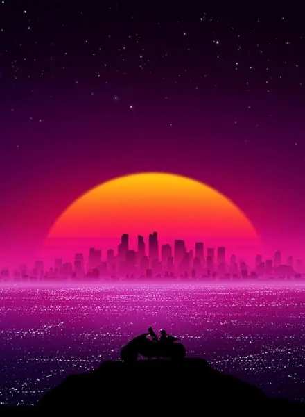 Home Screen